In the cacophony of our digital age, where every pixel screams for attention and every message vies for prominence, a gentle whisper often carries the most weight. This whisper, quiet but powerful, is the essence of minimalism in design. In a realm where less is, indeed, more, the minimalist design philosophy transcends mere aesthetics, becoming a solution to the visual and cognitive chaos we often find ourselves in.
1. The Roots of Minimalism
Origins in Art and Architecture: Minimalism began its journey in the mid-20th century, opposing the extravagance of previous eras. Pioneered by artists like Donald Judd and architects like Ludwig Mies van der Rohe, this movement embraced untreated materials, ditched superfluous ornamentation, and celebrated the purity of form and function.
Influence of Japanese Aesthetics: Japanese design, with its appreciation for nature and the transience of life, played a pivotal role in shaping minimalism. Concepts such as 'Ma', which emphasizes the beauty of space, and 'Wabi-sabi', which finds charm in imperfection, deeply resonate with minimalist principles.
2. Clarity Amidst Chaos
In our digital age, where information vies for our attention, minimalism acts as a sieve, filtering out noise and leaving behind only what truly matters. By reducing visual clutter, minimalist design ensures that the core message shines through.
3. Enhanced User Experience
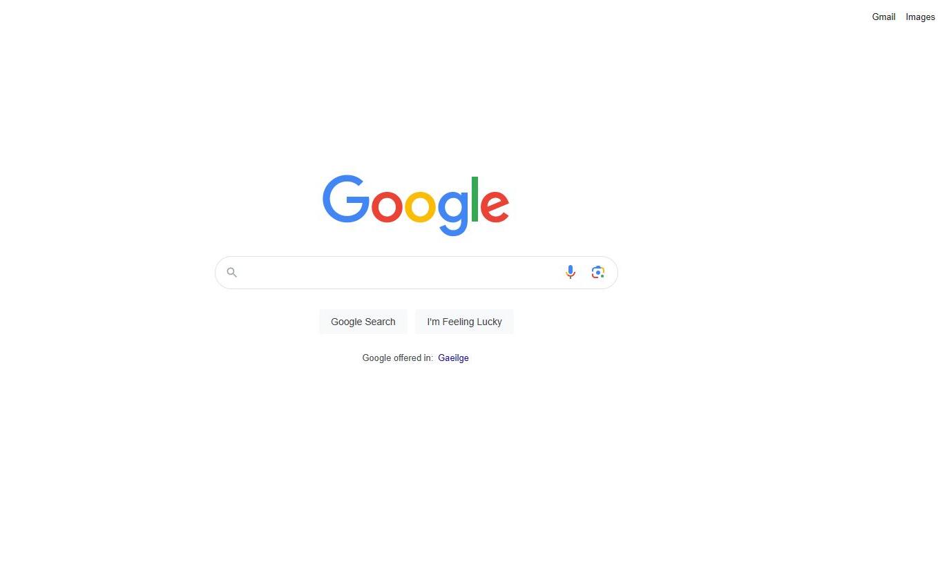
Minimalism in the digital space is not just about aesthetics; it's about user experience. A minimalist website or app, such as Apple's UI or Google's homepage, isn’t just visually pleasing. It is user-centric, ensuring that navigation is intuitive and interactions are seamless.
4. Emphasis on Content
In a minimalist design, content isn't just king; it's the kingdom. By stripping away distractions, design becomes a canvas, elevating content to its rightful place—centre stage. This ensures clear communication and content-driven storytelling.
5. Timelessness
Unlike fleeting design trends that come and go, minimalism is evergreen. It has an innate classic charm, ensuring that designs remain fresh and relevant, even as times change.
6. Flexibility across Platforms
Whether on a massive billboard or a tiny smartphone screen, minimalist design retains its essence. It adapts, scales, and ensures that brand messaging remains consistent across mediums.
7. Economical and Sustainable
Beyond aesthetics and functionality, minimalism has practical benefits. Using fewer resources, be it ink in print or pixels in digital, it’s both cost-effective and environmentally friendly.
The Magic of Minimalism: Why Less is More in Today's Design World
In the realm of design, minimalism is not just a style; it's a philosophy. It's about intentionality, where every element has a purpose, every space breathes, and every message resonates. From leveraging white space and limited colour palettes to prioritizing high-quality imagery, the magic of minimalism lies in its disciplined restraint and focus on the essentials.
Start with the Essentials
A design should begin with clarity of purpose. What is the core message?
Depth: When designers begin with a clear purpose, they channel their energy and creativity towards elements that matter. There’s a clear direction right from the onset.
Examples: Think of iconic brand logos like Apple. It's a simple apple with a bite taken out – a straightforward yet powerful representation of the brand's identity and its emphasis on knowledge, innovation, and detail.
Application: When conceptualizing a design, start by asking, "What do I want the audience to feel or understand?" This becomes your anchor, ensuring every design choice gravitates towards this core sentiment.
Use White Space Generously
White space is not empty; it’s potential. It’s a breath between words, a pause between notes. In design, it enhances readability and focus.
Depth: In art and design, negative space often holds as much significance as the occupied space. White space acts as a visual resting place and guides the viewer's eye.
Examples: Google's homepage is a classic example. Amidst the vastness of the internet and its endless corridors of information, Google offers a simplistic interface, making the user experience straightforward.
Application: When designing, resist the urge to fill every inch. Instead, allow elements to breathe, creating a balanced and harmonious layout.
Limit Your colour Palette
Colours speak, and in minimalism, they speak clearly. A limited palette ensures that the design's visual narrative is cohesive and harmonized.
Depth: Colours can evoke emotions, set moods, and convey messages. In minimalism, a restricted palette can provide stronger, more precise emotional cues.
Examples: The brand colour palette for McDonald's is simple yet unmistakable, focusing on red and yellow. These colours, associated with energy, warmth, and happiness, resonate with the brand's image.
Application: When choosing a palette, consider the emotional response you aim to elicit. Stick to 2-3 primary colours and utilize shades of these colours if more variety is required.
Simplified Typography
Fonts convey mood, tone, and intent. By limiting font varieties, designers can ensure clarity and a unified voice.
Depth: Typography plays a vital role in readability and brand recognition. Simplifying typography means choosing fonts that are both aesthetically pleasing and functional.
Examples: The New York Times uses a distinct yet straightforward font, allowing for both brand recognition and easy readability.
Application: Choose a primary font for headers and a complementary one for body text. Ensure they are legible across different devices and sizes.
Consistency is Key
A consistent design narrative strengthens brand identity and ensures a harmonious user experience.
Depth: Consistency builds trust. When users see a consistent design language, whether in colour, typography, or layout, they instinctively know they're interacting with a specific brand.
Examples: Brands like Coca-Cola maintain consistency not just in their product packaging but across all promotional materials and advertisements.
Application: Create a style guide. Detail out the colour codes, typography, spacing, and imagery guidelines. This guide becomes the touchstone for all design decisions, ensuring uniformity across the board.
To conclude, the essence of minimalistic design lies not in the absence of elements but in the careful, intentional selection and usage of them. It’s a design philosophy that, while looking simply, requires deep thought, clear intent, and meticulous execution. In a world dominated by information and visual overload, minimalism offers clarity, making it an ever-relevant and evolving design approach.


Comments (0)
Add a Comment