In paraphrase, the challenge was: design a bottle that somebody could recognise by touch in the dark. Make its shape distinctive enough to remain identifiable even when broken.
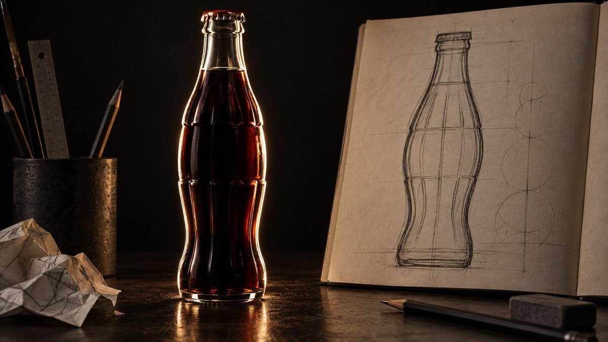 Original AI-generated editorial illustration by Time for Designs explaining the design brief. The abstract glass forms are not the actual Coca-Cola bottle, its prototype or patent artwork.
That was the remarkable challenge behind Coca-Cola’s contour bottle. It did not ask for a larger logo, a brighter label or an elaborate advertising line. It asked the container itself to carry the identity.
The solution is now familiar enough to seem inevitable. Its development was not. The design team found inspiration in a cocoa pod, although cocoa was not an ingredient in the drink. The original form also needed practical changes before becoming a production bottle.
Those details make this a more useful story than another celebration of an iconic brand. A clear brief produced an unusual object. Then the object had to work outside the drawing. The result shows how branding can become something people handle, carry and recognise—not merely something they read.
The problem was not a missing logo
Coca-Cola’s company history of the bottle describes a market in which competitors imitated its name and presentation. Bottlers used relatively ordinary straight-sided containers. Labels and lettering alone were not providing the distinction the company wanted.
Its account also describes paper labels peeling from bottles kept in cold water. That detail gives the design problem a physical setting. The identity had to remain useful where a label might become unreliable.
These are the company’s historical explanations, not a measured account of every mistaken purchase. But the problem is clear: recognition was depending on elements that could be obscured, lost or imitated.
Our interpretation is that the proposed bottle moved the identity into another layer of the experience. If the surface message stopped doing its job, the underlying form might still communicate.
The 1915 brief described a result, not a style
According to the company history, the Coca-Cola Bottling Association’s trustees voted on 26 April 1915 to fund development of a distinctive bottle. Glass companies were invited to propose a design.
The company’s historical account preserves the central challenge: recognition through touch and identification from a broken form. The brief describes an ambition; it is not proof that every person could identify every fragment.
What makes the brief memorable is its direction. It tells the designer what the object should enable, rather than prescribing a fashionable visual treatment.
The brief also imposes a useful limit. The proposed difference has to live in the bottle, not only in the label attached to it. The designer cannot answer the challenge simply by printing more information.
The library search took an unexpected turn
The High Museum identifies Earl R. Dean as the designer working with the Root Glass Company team in Terre Haute, Indiana. Its account says Dean and Clyde Edwards went to the local library looking for inspiration connected to coca leaf and kola nut.
They encountered an illustration of a cocoa pod instead. Although cocoa was not an ingredient in Coca-Cola, its swelling form and ribs provided a visual direction for the bottle.
This is the surprising detail worth keeping. The design was not a literal diagram of the product’s contents. A mistaken botanical connection supplied a useful form.
That does not make inaccurate research a desirable design method. It means the origin of an idea and the reason the resulting design works are not always identical. A shape can begin in one association and acquire another through use.
It also challenges the assumption that every brand element must illustrate exactly what the business sells. A distinctive identity can create a relationship through repetition rather than through a literal picture.
For a designer, the important next question is not whether the inspiration sounds clever in a presentation. It is whether the proposed form answers the actual brief.
The drawing made the idea specific
The resulting bottle had a fuller central section and vertical ribs. The shape created a recognisable difference before any argument about the drink’s flavour or advertising message was added.
Looking at the original US design patent, number 48,160, helps separate the historical object from the bottle people may picture today. The patent was granted on 16 November 1915. It names Alexander Samuelson and assigns the design to Root Glass Company.
The document concerns an ornamental bottle design. It is not a patent for the drink’s recipe. Its drawing records a particular proposed form, rather than proving every later story told about that form.
It also reminds us to distinguish the names found in different kinds of evidence. The museum attributes design work to Dean and the Root team; the patent names Samuelson. Those records should be stated accurately rather than compressed into a single unsupported hero story.
Design history often becomes more interesting when it retains collaboration. The brief, research, drawing, glassmaking and commercial adoption belong to related but different parts of the work.
The familiar object can hide that sequence. The document allows us to see one stage before familiarity took over.
The first shape was not the finished answer
The National Archives Foundation’s account explains that the original prototype was top-heavy and unstable. It describes the commercial version adopted in 1916 as slimmer, with a wider base.
The High Museum’s object description identifies another practical issue: the bulging centre was too large for delivery crates. Its account likewise describes the design being slenderised for production.
These accounts emphasise different practical constraints. They agree on the important point: the initial design needed refinement. It is unnecessary to pretend that one explanation is the complete account of every production decision.
This is the turning point of the story. The bottle’s unusual shape had answered a recognition problem, but recognition was not the only job a bottle had to do.
It had to stand, fit into a distribution system and work as a manufactured object. The design could not succeed merely because it looked distinctive in isolation.
Compare the broad original form with the slimmer production version and the distinction becomes useful. An object can change substantially in proportion without becoming an unrelated object.
Our reading is that the design’s central recognisable features survived the practical adjustment. The refinement changed how the bottle worked without simply returning it to an ordinary straight-sided container.
A distinctive bottle still needed people to use it
A design selected for production is not automatically a design adopted everywhere. The existence of an object and its repeated appearance in customers’ lives are different milestones.
Coca-Cola’s own historical account describes resistance from bottlers facing the expense of replacing existing glass stock. This is another reason not to write the bottle’s story as one brilliant sketch followed immediately by universal recognition.
We do not need an invented return-on-investment figure to understand the difficulty. A packaging change can involve equipment, stock, processes and established habits. Someone has to make the new design real at each practical point where it is used.
The package also had to travel
A bottle is handled individually, but people sometimes need to carry several. That changes the design problem again.
Coca-Cola’s history of its dispensing and packaging developments dates its introduction of a six-pack carrier to 1923. It connects the carrier with taking drinks home as household refrigeration became more available, and records a subsequent packaging patent in 1924.
The point here is not to award an unsupported claim of inventing every modern multipack. It is to notice the shift in the customer’s task. Identifying one bottle and transporting several bottles are different needs.
The bottle did not need to explain the whole business
The contour bottle’s original job was specific. It was meant to make a product identifiable without depending entirely on a surface label.
A cocoa-pod illustration helped suggest a form. Glassmaking turned it into a prototype. Practical constraints changed that form before production. Repeated use gave the design a life beyond its original drawing.
A bottle is a small object. In this story, asking it to do one clear job led to a design people still discuss a century later.
Sources and scope
The linked company histories, original design patent and museum and archival accounts document the bottle’s development. Company and exhibition narratives are identified as such; the High Museum exhibition was organised in collaboration with Coca-Cola, and the National Archives Foundation page records company support for its featured-document display. Interpretation of recognition, packaging and practical design is Time for Designs’ analysis. This article makes no isolated sales-effect claim and offers no legal advice about protecting a design.