A website address printed on a leaflet cannot update itself. The website behind it can change completely while the ink remains exactly where it was.
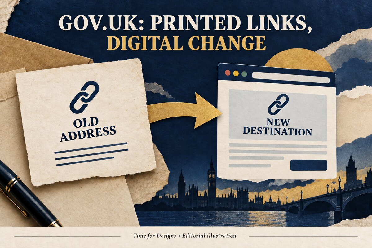 Original AI-generated editorial illustration by Time for Designs, not a GOV.UK screenshot or an original government document.
That small mismatch creates a surprisingly large branding question. When an organisation changes its online identity, what happens to the people still following its old physical invitations?
In October 2012, the UK Government Digital Service had to confront that question while replacing Directgov and Business Link with GOV.UK. The old websites did not exist only inside browsers. Their addresses had travelled into printed objects.
The resulting story is more useful than a claim that matching branding automatically increases revenue. It concerns something a customer can actually experience: whether the next step printed on an object still takes them somewhere meaningful.
A successful-looking launch and a useful transition are not necessarily the same achievement. The new site needs to make sense. The old routes into it need attention too.
A new online home, rather than a new coat of paint
GOV.UK launched on 17 October 2012, replacing Directgov and Business Link as the first phase of a wider move towards a single government domain. The official announcement explained that the change was not simply a transfer of existing content: services and information had been examined, redesigned and rewritten around users’ needs. The dated launch announcement establishes the intended scope.
That distinction matters. A new visual identity can be applied to old information without changing the way people find or understand it. This project presented a more substantial ambition: to reorganise the online experience.
The announcement is evidence of the launch and its stated approach. It is not, by itself, proof that every visitor found every service easier or that every later transition worked perfectly.
For our purposes, the important tension is clear. A new online home was replacing two established destinations. People would still arrive with expectations formed elsewhere.
The old addresses had already escaped into the physical world
Six days before launch, GDS developer Paul Downey published “No link left behind”. He described Directgov addresses on Job Centre posters, official stationery, mugs and calculators, and explained that printed material could remain in circulation after the websites changed.
The team did not want those routes to end at abandoned pages. Nor did it want departments to discard stationery or reprint every leaflet simply because an address had changed. Downey described individual redirects from old pages to appropriate equivalents on GOV.UK, rather than sending everyone to the new homepage. His example was an old bank-holidays link leading to the new bank-holidays page.
This was a plan described before the launch. It should not be treated as independent verification that every old address worked forever.
The design problem, however, is memorable. The organisation could change its website. It could not instantly retrieve every object that had pointed people towards the previous one.
The smallest printed detail was part of the service
A web address often occupies very little space in a design. It can sit beneath the main headline, beside contact details or on the back of a leaflet.
Its visual size does not determine its practical importance. If it is the route to the next answer, it is doing consequential work.
Our interpretation of the GOV.UK episode is that printed identity includes destinations as well as appearances. A familiar name can tell someone which organisation is speaking. A working address can help them continue the task.
Those functions are related but different. A perfectly reproduced logo does not repair an obsolete link. A new homepage may look reassuring while still leaving a person to search again for the information the leaflet promised.
Why an equivalent page differs from a homepage
Imagine a fictional visitor holding a leaflet about one service. The printed address suggests that following it will reveal details about that service.
If the visitor reaches the general homepage instead, the technical journey may appear complete: the old address has led somewhere. The practical journey is not complete. The visitor must identify the relevant section and recover the context.
That example is illustrative, not a report of a measured GOV.UK failure. It explains why destination choice matters.
A redirect can preserve the connection between an old promise and a new answer. It can also conceal a broken connection behind a functioning page.
The appropriate destination depends on what happened to the original information. A genuine replacement, an explanation of a retired service and an unrelated homepage are not interchangeable answers.
Recognition was not the whole problem
In a September 2014 experimental design note, Chris Heathcote discussed government emails. He described a need for recipients to recognise the sender, judge whether the message was genuine, understand why it had arrived and know what to do next. The team was considering consistent headers and clearer link presentation; these were proposals under discussion, not completed standards announced in the post. The contemporary design note records that investigation.
This extends the physical–digital lesson without turning it into a claim that an official-looking email is secure. Visual resemblance is not proof of authenticity.
The later standard included people who were not using the website
The current GOV.UK Service Standard asks teams to provide a joined-up experience across the channels users need. Its examples include online, telephone, paper and face-to-face routes. It also says that encouraging digital use should not make other routes harder to find. The cross-channel standard was first published in 2019 and subsequently updated; it is later guidance, not a rule we are projecting backwards onto the 2012 launch.
This is a useful counterweight to a purely visual view of branding. A service can have consistent colours while requiring someone to repeat information or start again when they change channel.
The standard describes an ambition and requirements for service teams. It does not prove that every public service achieves them.
Recognition, information and handover
A practical review of physical and digital material can separate three layers:
- Recognition: can the person identify the business and the subject?
- Information: are the product, contact details and important conditions accurate?
- Handover: does the next step lead to a useful answer or conversation?
Start with real material already in use. Follow its links. Compare the named offer with the destination. Check the contact route and identify anything that has changed.
Record an observed problem before deciding how to fix it. “The old leaflet leads to an unrelated homepage” is a specific finding. “The branding needs more impact” is not yet an explanation.
This is not a promise that a continuity review will increase revenue. It is a way to make the customer experience inspectable instead of discussing it only in general terms.
The old object is still speaking
The most memorable part of this story is not a dramatic new screen. It is an ordinary printed address that cannot change when the organisation does.
A poster, card or leaflet continues making an invitation after it leaves the business. The destination is part of that invitation.
The colours can be consistent while that handover fails. The appearance can change while the meaning remains intact.
A rebrand is therefore not complete merely because the new website looks finished. The older routes into the business still deserve an answer.
Sources and scope
This account uses official GOV.UK and Government Digital Service records. The 2012 redirection post describes a planned transition; the 2014 email post is explicitly experimental; the later Service Standard is guidance, not proof of universal delivery. Examples of local businesses are hypothetical. The practical interpretation is Time for Designs’ own.