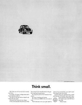
Imagine buying a whole advertising page and making your product look small.
Not small by accident. Not squeezed into a corner because the designer had run out of room. Deliberately small, with space around it that another advertiser might have filled with a larger photograph, another benefit or a more excited headline.
Volkswagen’s “Think Small” advertisement invites that question before the reader has absorbed the sales argument. Why is the car so small on the page? The headline answers it: smallness is the point.
The idea matters because it is more than a memorable line. The photograph, headline and product argument support one another. Remove the words and the layout still expresses smallness. Remove the picture and the words still direct the reader towards it. Put them together and the page begins to make an argument before the detailed copy has done its work.
It also offers a lesson that is easily missed when famous advertisements become shorthand for “creative genius”: the job was to sell a real car in a real market, not to produce an empty page that other designers would admire.
The story begins before the 1960s
Volkswagen’s own historical chronology dates the start of its professional American campaign with Doyle Dane Bernbach to 17 August 1959. It describes a competitive problem involving Renault and American manufacturers’ compact-car push, rather than a simple contest between one small imported car and nothing but huge American cars.
The chronology credits art director Helmut Krone and copywriter Julian Koenig, and identifies Wingate Paine as photographer on its reproduced “Lemon” advertisement. It records “Think Small” and “Lemon” among the campaign’s early classics. These details put named creative contributors back into a story sometimes reduced to a single agency or brand. Volkswagen Group’s 1950–1960 chronology.
The date is worth retaining. Although the campaign belongs in a discussion of the advertising associated with the 1960s, it did not suddenly begin when the calendar turned to 1960.
Nor was Volkswagen a business waiting for an advertisement to create its first customer. Advertising was one part of a wider manufacturing, product and distribution story. Keeping that distinction makes the creative achievement more believable, not less impressive.
The empty space was doing work
White space is frequently discussed as a sign of premium design. That explanation is too vague to be especially helpful here.
On a page built around smallness, the space establishes a relationship. The reader sees the product against the page, rather than merely seeing a product photograph. Scale becomes something the design demonstrates.
The distinction matters. A layout can say “small” through a caption while making the object dominate every available centimetre. The words then argue one thing and the picture argues another.
In the famous “Think Small” arrangement, the page supports the headline. The space is not a separate flourish. It helps the reader understand the idea.
Two words that change the question
“Think Small” does not behave like a list of specifications. It gives the reader a way to interpret the specifications.
That is an important difference.
A product can have many facts attached to it, but a customer still needs to know which facts matter. The headline introduces a perspective. It asks the reader to consider smallness rather than treating it as an obvious disadvantage.
There is a useful restraint in the wording. It does not attempt to announce everything the business can offer. It gives the page one central task.
The two-word line is memorable, but brevity is not the whole explanation. “Buy Today” is also short. What matters is the connection between the words, the product and the argument that follows.
“Lemon” and the importance of reading past the headline
Volkswagen’s official chronology also reproduces “Lemon”, an advertisement whose deliberately alarming headline introduces a quality-control explanation. The word is not the whole argument; the explanation changes how the reader understands it. Volkswagen’s reproduced “Lemon” advertisement and credits.
This creates an important boundary for anyone hoping to imitate the technique.
A negative word is not automatically a clever advertisement. It becomes useful only when the explanation is strong enough to resolve the concern it creates.
What the campaign record can establish
It is tempting to attach a dramatic sales figure to a famous advertisement and stop there. The headline attracted attention; sales rose; therefore the headline caused the rise.
That is not a reliable conclusion without much stronger evidence.
Cars are affected by price, product suitability, stock, dealer coverage, competing models, economic conditions and other advertising. A retrospective company history can establish that a campaign happened and explain how the company describes it. It does not isolate the advertisement’s contribution from every other factor.
This article therefore does not claim that “Think Small” alone caused a specified sales increase.
Smallness was the idea, not a rule
The achievement was specific: the car’s small size became the organising idea of the page. The headline and the surrounding space expressed it together. A tiny car on a large page made the product’s difference visible before the reader reached the detailed argument.
Sources and further reading
- Volkswagen Group: 1950–1960 corporate chronology — campaign date, commercial context, creative credits and reproduced period advertising. This is a primary company source, not independent proof of advertising causation.
The discussion of hierarchy, white space, copy and modern customer journeys is Time for Designs’ interpretation, not a quotation from the campaign’s creatives.