

On 3 July 1963, the British government announced that it broadly agreed with the recommendations of the Worboys Committee on traffic signs. The next step was not simply to publish a design and hope everyone understood it.
 Original AI-generated editorial illustration by Time for Designs. These are conceptual letterforms and arrows, not official traffic signs, the Transport typeface or a historical installation.
New signs would be exhibited in Parliament and at the Institution of Civil Engineers. On roads in Birmingham, examples would replace older signs to demonstrate the system in actual use.
That is an unusually revealing moment in a design story. A visual language was about to leave the report and enter the places where people had to read it.
Jock Kinneir and Margaret Calvert are associated with some of Britain’s most familiar signs. But the interesting achievement was not one recognisable image or one fashionable typeface. It was the relationship between lettering, symbols, layout and the circumstances in which they would be encountered.
This is a historical account of British public-road design, not a specification for present-day signs or a claim that Time for Designs supplies certified traffic signs.
The problem was visible before the answer was familiar
The Design Museum’s account describes graphic designer Herbert Spencer photographing the assorted signs on a journey from central London towards Heathrow. His photographic essays appeared in successive issues of Typographica in 1961.
The value of that exercise was the sequence. A single sign could be judged as an isolated object; a journey revealed the mixture of approaches a reader actually encountered.
Our interpretation is that this is a powerful way to recognise an information problem. The designer stops asking whether each object looks acceptable and begins asking whether the route makes sense.
A collection can have well-designed parts and still be confusing as a whole. Readers must make sense of how the words, shapes and directions change from one sign to the next.
That is why this story belongs to signage rather than simply to typography. The letters mattered, but they were part of something larger.
A partnership formed around information in places
Kinneir’s work was not confined to designing a pleasing page. Robin Kinross’s biography for the Jock Kinneir Library records his work at the Central Office of Information and the Design Research Unit before he established his own practice.
The Gatwick commission brought him together professionally with Calvert, a former student. Work for P&O followed, involving a baggage-labelling system that had to communicate across different countries with limited text.
The connection is worth considering without turning it into an inevitable career story. An airport, a luggage label and a road sign are different objects, but each belongs to an encounter between information and a person trying to navigate something.
Our reading is that the unit of design is not always the finished graphic. Sometimes it is the journey in which that graphic participates.
A label makes sense alongside other labels and the task being performed. A direction sign makes sense alongside a route and a forthcoming decision. Looking only at the object leaves part of the assignment outside the frame.
The new alphabet did not settle the argument
It is tempting to tell this story as a contest between an obviously correct modern design and an obviously obsolete alternative. The historical record is less tidy.
Kinross records a counterproposal by lettercutter David Kindersley, using an all-capital serif alphabet rather than Kinneir’s upper- and lower-case sans-serif approach. His account states that legibility tests showed no significant difference between the competing approaches.
That does not prove that typography was irrelevant. It warns against turning a complex design decision into a universal claim that one category of letter is always more legible than another.
A sign contains words arranged at a particular scale within a layout. Its encounter also involves position, viewing conditions and the information being requested. A result about one comparison is not automatically a verdict about every use.
For us, the more interesting historical lesson is that a familiar outcome can conceal a disputed process. Knowing which system survived does not entitle us to invent a simple explanation for why every alternative failed.
The letters belonged to a system
The Design Museum describes different weights of Transport addressing contrasting background conditions. It also explains the notional tiles used to organise letter spacing and proportional rules that related layout elements to the lettering.
These details move the story beyond a choice of font. A coordinated arrangement needed rules that could be applied to different words and different signs.
Our reading is that a system needs to work repeatedly. A designer can arrange one sign by eye. A national set needs rules for many signs, without starting every decision again.
This is where apparently quiet details become consequential. Space between elements is not merely spare room. It helps separate information, indicate relationships and prevent different parts of the message from merging.
The viewer does not need to know how the spacing was specified. That is part of the point. Work done behind the scenes should make the encounter less demanding, not require the reader to appreciate the mechanism before understanding the information.
A pictogram still contains a choice
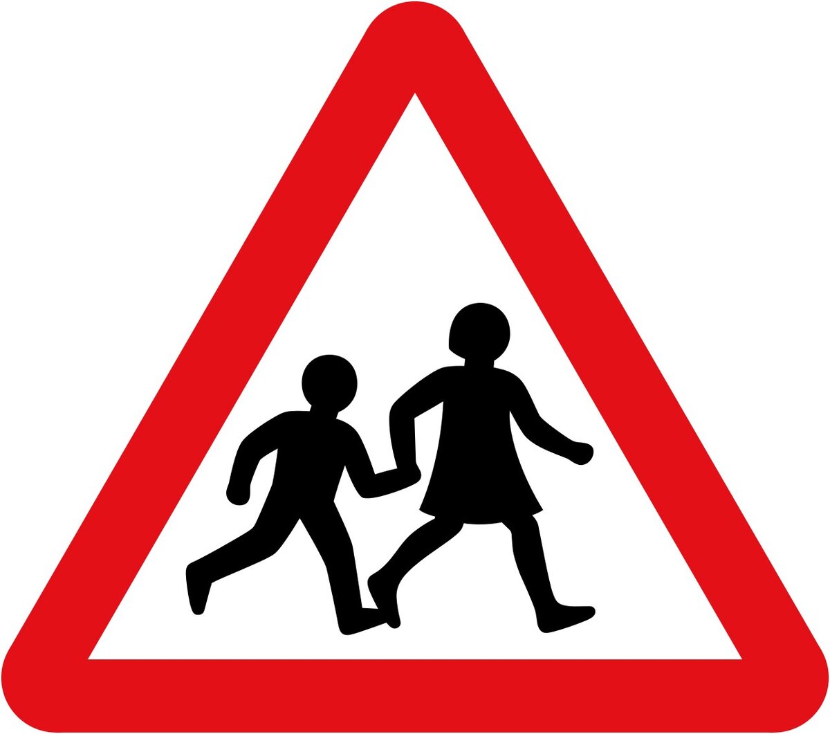
The road-sign story is also the story of drawn figures. The Office of Rail and Road’s account of Calvert identifies familiar pictograms associated with her work.
It records that the girl in the children-crossing sign was based on Calvert herself as a child, and that the cow in the farm-animal warning was inspired by an animal on relatives’ farmland.
These are memorable details because the resulting images appear so impersonal. A figure that becomes widely familiar still began with somebody deciding what to draw and what to leave out.
Our interpretation is not that every effective symbol needs a personal origin. It is that simplicity is produced through decisions. A small silhouette can carry an enormous amount of visual responsibility.
The historical anecdotes help us notice that responsibility. They do not establish a measured improvement in safety or prove that every reader understood a symbol identically.
The report was not the finished public experience
The Hansard record of 3 July 1963 documents the government’s response to the Worboys report. Lord Chesham described exhibitions and the Birmingham demonstration, while explaining that regulations and consultation remained necessary.
That account shows a transition rather than a single launch button. Government agreement, public explanation, demonstrations and implementation were connected but distinct steps.
Our reading is that this is an important part of the design achievement. A system can be coherent in a report while still needing to be introduced into an existing environment.
The reader also brings expectations from what came before. A replacement is not encountered in a vacuum. It changes the relationship between familiar information and a different presentation.
We should not claim that the exhibitions solved every difficulty. The record establishes that explanation and demonstration formed part of the proposed introduction. That is already more interesting than treating adoption as automatic.
A new visual language also meant physical objects
Two years later, parliamentary questions concerned a less glamorous part of the project: the posts supporting the signs.
In the 28 April 1965 written answers, Geoffrey Wilson asked about simplifying the range of steel tubes to assist implementation. Minister Tom Fraser replied that larger signs had required a slight extension to post sizes and that guidance would be addressed in the Traffic Signs Manual.
The same exchange records a question about changes to prohibition symbols. Fraser explained that a proposed red bar conflicted with the European protocol, while the circular shape and red border communicated prohibition.
These are historical statements about the British programme, not current installation or regulatory advice.
They reveal two different constraints. A sign needed a physical means of support, and its graphic conventions belonged to a wider framework. A finished drawing did not remove either requirement.
Our interpretation is that implementation tests a design in ways the presentation alone cannot. The object has to be made, placed and used. The rules it communicates must also agree with the rules around it.
Why this is not a story about a single clever symbol
The cow and crossing children are memorable. They give the story human detail. But they should not reduce the whole project to charming pictograms.
The evidence also concerns alphabets, spacing, proportional arrangements, public introduction and physical implementation. Each answers a different part of the assignment.
Our reading is that the achievement lies in coordination. If a reader must relearn the relationships at every encounter, the collection is not doing the same work as a system.
That does not mean every sign must look identical. Different information requires different arrangements. Coherence concerns the useful relationships that survive those differences.
A design system is therefore neither a pile of finished objects nor an instruction to repeat one composition everywhere. It is a way to keep decisions understandable across varied circumstances.
From roadside furniture to a museum collection
Objects designed for ordinary use can look different when a museum asks us to stop and examine them.
MoMA’s collection record identifies a road-works sign by Kinneir and Calvert, with a design date spanning 1957–1967. It also records the object’s construction and manufacturer.
The design date is not a claim that this particular museum object was made in every year of that span. Museum records distinguish a design’s history from the individual object representing it.
The change in viewing circumstances is interesting. At the roadside, the symbol belongs to a task. In a collection, it can become the subject of attention.
Our interpretation is that both encounters matter. A familiar sign can be worth studying precisely because its normal purpose does not involve asking the viewer to admire it.
The museum does not supply proof that the sign caused a specific outcome. It provides an identifiable artefact through which the design can be examined.
The work did not stop with the road-sign story
Calvert’s career should not be reduced to one completed historical episode.
The Design Museum’s Woman at Work display, held from October 2020 to September 2021, marked the launch of Rail Alphabet 2. The museum described her collaboration with Henrik Kubel in response to a Network Rail wayfinding system designed by Spaceagency.
That later project matters here because it shows adaptation rather than preservation for its own sake. A name and a visual history can continue while the circumstances and the requirements change.
Our interpretation is that longevity does not mean leaving a system untouched. The useful question is which relationships remain helpful and which need reconsideration.
This article does not assess Rail Alphabet 2’s performance or claim that a historical reputation guarantees the success of later work. The documented collaboration is enough to show that the story continued beyond the familiar roadside symbols.
The local lesson is about the encounter, not copying the signs
A business sign and an official traffic sign are not interchangeable. Different responsibilities and requirements apply. The historical British system is not a template to reproduce casually for a premises.
The useful connection is more fundamental: information is encountered somewhere by somebody trying to understand or decide something.
For a business, that might involve recognising the entrance, finding reception or identifying a collection point. These are hypothetical examples, not claims about completed Time for Designs projects.
Start with that encounter before choosing a visual treatment. What does the unfamiliar visitor need to know at this point? Which information belongs elsewhere? How does the proposed sign relate to the next step?
Then assess the actual location and the proposed object. The purpose does not confirm the material, dimensions, fixing or suitability by itself.
For business identification and directional requirements, see our signage service in Cashel and Tipperary. Share the location, photographs, approximate measurements, wording, artwork and required date so the job can be assessed. Call 062 61524 or visit the Cashel shop.
This is not an offer of official traffic-sign certification or a promise of compliance, safety performance or a particular material lifespan.
The design people do not have to think about
A road sign is not usually approached like a poster in a gallery. The reader has another purpose.
Kinneir and Calvert’s story is compelling because it takes that ordinary encounter seriously. The work extends from letter shapes to relationships, from a report to public introduction, and from the visual face to the object that has to exist in a place.
Our practical conclusion is that effective signage begins before the decorative choice. It begins by understanding what the person needs from the encounter.
The result need not announce how much thinking produced it. Sometimes the design has done its job when somebody can understand the information without having to think about the designer at all.
Sources and historical limits
This account draws on the Design Museum, the Jock Kinneir Library, the Office of Rail and Road, contemporary Hansard records and MoMA’s collection catalogue. Interpretations about information, coordination and customer encounters are Time for Designs’ own.
The sources differ on some early commission and trial dates. This article therefore does not assign a disputed exact date to the Gatwick commission or the first Preston trial. It also does not claim a quantified reduction in accidents, a sales effect or present-day regulatory suitability.