
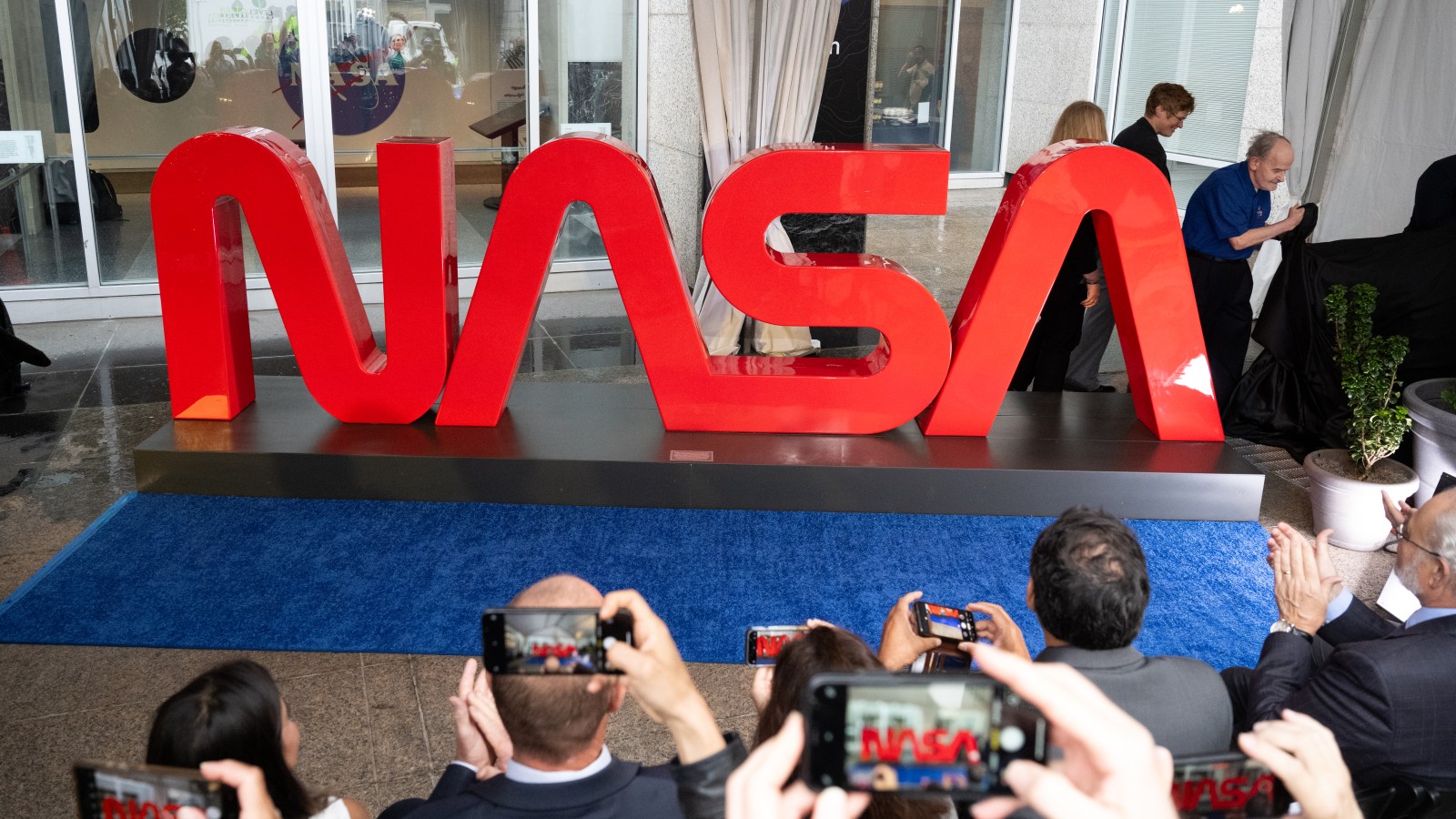
The NASA “worm” sign at NASA Headquarters in Washington, unveiled in June 2023. Credit: NASA/Joel Kowsky. View the official NASA image and context. Used editorially; NASA does not endorse Time for Designs.
In May 2020, a red word appeared on the side of a SpaceX Falcon 9 rocket preparing to carry astronauts from American soil. It looked like a message from the future: four flowing letters, two open As and no decorative emblem around them.
The strange part was that the design was already 45 years old.
NASA had introduced this wordmark in 1975, retired it in 1992 and spent almost three decades using its older round insignia instead. Yet the supposedly obsolete logo never vanished from public memory. It survived on clothing, in films, in design books and in the affection of people who had grown up seeing it on spacecraft and television screens. When it returned for NASA and SpaceX's Demo-2 mission, it did not feel like an antique being dusted off. It felt current.
This is the story of the NASA “worm”: why it was created, why many people inside NASA resisted it, how it was removed almost overnight, and why the agency eventually discovered that its old and new identities did not have to defeat each other.
It is also a story about something every organisation eventually confronts. A logo can be technically excellent and still lose an emotional argument. It can be officially retired and remain culturally alive. And sometimes the public remembers a design more stubbornly than the organisation that commissioned it.
Before the worm, NASA had the meatball
NASA's round red, white and blue insignia dates from 1959, the agency's second year. Employee James Modarelli adapted elements from NASA's formal seal into a less formal symbol: a blue sphere suggesting a planet, white stars for space, an orbiting spacecraft and a red aerodynamic shape representing aeronautics.
Today it is almost impossible to separate that symbol from the early space programme. It appeared during the Mercury, Gemini and Apollo eras, so it accumulated meaning far beyond the individual shapes in the artwork. For NASA employees and the public, it became attached to astronauts, launches, risk, national ambition and the Moon landings.
The nickname “meatball” came later, when NASA needed an informal way to distinguish it from the identity that replaced it. The name sounds irreverent, but the affection behind it was real.
There was also a practical weakness. The symbol was complex. NASA's own history says that with 1970s reproduction technology it could be difficult to print cleanly. Several colours, fine stars, an orbit and overlapping shapes had to survive government printing, signs, uniforms, vehicles, technical documents and every other setting in which the agency appeared. Richard Danne later recalled that poor reproductions could resemble a thumbprint.
That distinction matters. A logo can be famous and still be difficult to use. Recognition and production performance are different tests, and NASA was about to discover that improving one could threaten the other.
The problem after Apollo was bigger than a logo
By the early 1970s, the atmosphere around NASA had changed. Apollo's great television moments were behind it, while the Space Shuttle era had not yet properly begun. The agency still carried immense prestige, but it could no longer depend on a succession of world-stopping missions to create attention automatically.
At the same time, different NASA centres and contractors produced communications with little overall visual unity. In a 2020 interview for NASA's official Houston We Have a Podcast, Danne described the situation as a graphic “wild west”. Centres behaved independently, contractors made their own decisions and the organisation did not consistently look like one agency.
The United States' National Endowment for the Arts had created the Federal Design Improvement Program to address weak and inconsistent communication across federal agencies. NASA was an attractive early test: it was highly visible, associated with advanced technology and capable of showing whether better design could work at government scale.
The task was therefore not simply, “Draw a cleaner space logo.” It was to make publications, forms, signs, vehicles, aircraft, uniforms and facilities feel as if they belonged to the same organisation.
That is the first reason this story remains useful. Branding projects often begin with a request for a new logo when the real problem is uncontrolled application. If every branch, employee, supplier or contractor invents a slightly different version, replacing the central artwork will not by itself create consistency.
A young design firm was given an enormous assignment
Danne & Blackburn was a young New York firm. Richard Danne and Bruce Blackburn had formed the business in 1973, shortly before NASA's request arrived. Blackburn had previously worked at Chermayeff & Geismar and had helped create the United States Bicentennial symbol, experience that Danne believed helped their new firm make the shortlist.
The designers studied the agency's scattered material and decided that NASA needed clarity, simplicity and a device capable of holding many different operations together. They reduced the name to four continuous-looking, single-width letters. The crossbars disappeared from the As. The curves suggested motion without adding a literal rocket, planet or orbit.
The red version became the most recognisable, although the system also allowed approved black and white applications. The official name was simply the NASA logotype. “Worm” began as an informal description of its flowing shape.
Danne later explained that the team spent about a month refining it. This was before digital drawing, instant duplication or scalable vector files. The apparent mechanical precision was produced by hand.
The firm then made a decision that would make many modern clients nervous: it presented one solution.
Instead of protecting that single proposal with a folder of alternatives, the designers demonstrated it. Danne recalled preparing roughly 25 applications at considerable extra effort—publications, forms, signs, vehicles, aircraft and spacecraft—so the people in the room could see a complete visual programme rather than four red letters in isolation.
The logo itself divided opinion. The applications changed the conversation. Once the mark appeared across the real world of NASA, the proposal became easier to understand: this was not decoration to be stamped onto things. It was infrastructure.
The 1976 manual made the identity real
NASA approved the logotype in 1975, and the following January issued its detailed Graphics Standards Manual. The document is still striking because it concerns itself with ordinary, physical decisions as seriously as glamorous ones.
It deals with typography, publication grids, colour, stationery, forms, signboards, aircraft, uniforms and vehicles. It specifies clear space and positioning. It explains when markings should be black, white or NASA red. Vehicle layouts consider door handles, mirrors, body contours, chrome strips and the contrast between lettering and paint colour.
These details are not the boring part after the design. They are the work that allows the design to survive.
A beautiful identity can quickly become weak if nobody knows which file to use, how small it may appear, what happens on a dark surface or how contact information should sit beside it. The manual turned a memorable shape into a repeatable system for NASA employees, centres, printers, signmakers and contractors.
It also had to teach. Danne explained that many of the people applying the identity were not designers, so the manual included grids, demonstrations and firm “do and don't” guidance rather than assuming specialist knowledge.
Decades later, the manual itself became a coveted design object. A 2015 crowdfunding campaign to reproduce it raised $941,966—about five times its original goal, according to a later NASA publication. That is an extraordinary afterlife for what was essentially an internal rulebook. People were not only nostalgic for the logo; they wanted to study the thinking that made it work.
The design solved a production problem—but created an emotional one
The worm was easier to reproduce and better suited to the modern system NASA wanted. None of that erased what the meatball meant to people who had lived through Apollo.
Some longtime employees saw the earlier insignia as part of the agency rather than a piece of artwork applied to it. The new identity arrived from an external programme and appeared to replace a symbol associated with NASA's greatest achievements. The nickname “worm” could be affectionate, but NASA historians note that it was also used dismissively by people who disliked the change.
This is a recurring danger in rebranding. Designers can demonstrate that a new mark is simpler, clearer and more flexible. Customers or employees may still experience the change as the removal of something that belongs to them.
Neither side has to be foolish. The production argument can be correct, and the emotional objection can also be real.
The worm nevertheless became part of a remarkable period of NASA history. It appeared with the Space Shuttle, on the Hubble Space Telescope and beside astronauts including Sally Ride, Guy Bluford, Mae Jemison and Bruce McCandless. It gathered its own memories. A symbol introduced to replace nostalgia eventually became nostalgic itself.
In 1992, the worm was removed with startling speed
Daniel Goldin became NASA administrator in April 1992. During an early visit to Langley Research Center, he decided to restore the meatball and retire the worm. NASA's later account says he believed the agency needed a morale boost, and the older symbol offered an immediate connection with the confidence of its early achievements.
The decision surprised the design community and many people within NASA. Danne described it as a thunderbolt. There had been no gradual transition or long public evaluation.
The agency's official historical study, Emblems of Exploration, describes a scramble to remove or conceal the worm across NASA facilities. Staff informally called the effort a “worm hunt”. At Langley, a meatball sign was hurriedly placed above a podium while the logotype was being removed.
The reversal is revealing. In 1975, the meatball had represented an old system that was difficult to reproduce. In 1992, its very age was an advantage. It offered continuity, morale and a link to Apollo at a moment when the organisation wanted those associations.
The worm's practical strengths did not save it because the decision was not primarily a production comparison. It was about which chapter of NASA's history the agency wanted to evoke.
The retired logo refused to disappear
An organisation can stop using a mark, but it cannot easily remove that mark from culture. The worm had spent 17 years on machinery, clothing, publications and television coverage. Its clean shape reproduced beautifully on the very merchandise and media that could continue circulating long after the official change.
Its visual age also became ambiguous. Designs tied too closely to a fashion can look trapped in their decade. The worm's extreme simplicity allowed it to be read as both retro and futuristic. A child could encounter it on clothing without knowing it had been discontinued before they were born.
Danne observed that it remained especially popular in Europe and Asia and continued appearing in popular culture. Designers admired the manual. Space enthusiasts remembered the missions. Younger audiences adopted the mark without carrying the institutional dispute that had surrounded its introduction.
In 2017, NASA again permitted the worm on souvenir merchandise. The change did not make it the agency's primary identifier, but it acknowledged what the marketplace had already demonstrated: the design still had unusual cultural power.
NASA later said its merchandise team receives hundreds of requests each month to use the agency's graphics. Demand of that kind does not prove that every old logo deserves revival. It does show that identity value can survive outside an organisation's current brand manual.
The 2020 return worked because it had a job to do
NASA did not announce that the meatball had failed or that the 1992 decision was being reversed. Instead, the worm returned for selected use alongside the official insignia.
Its first major official comeback was the SpaceX Demo-2 mission in May 2020, which carried astronauts Doug Hurley and Bob Behnken to the International Space Station. The mission marked the return of human spaceflight from American soil on an American rocket after nearly nine years.
The visual choice was unusually well matched to the event. A logo created to represent a modern technological era reappeared at the beginning of another one. Its history added meaning without making the mission look backward.
NASA's announcement was careful: the meatball would remain the primary symbol, while the agency considered other appropriate uses for the worm. The comeback therefore avoided the winner-and-loser framing that had defined the earlier switches.
This is a more mature form of consistency. It does not mean using one mark in every circumstance. It means defining the role of each approved mark so the audience is not left to guess.
Artemis turned the old logo into a production job again
The worm's return was not confined to a press release or a digital mock-up. NASA used it on Artemis I hardware as the agency prepared to send its powerful Space Launch System rocket and Orion spacecraft around the Moon.
The application process makes the story wonderfully physical. Teams used a laser projector to position and mask the large curved letters on the rocket's solid boosters. They applied two coats of red paint followed by multiple clear coats. On Orion, technicians used flight-proof decals on the crew module adapter. The meatball appeared elsewhere on the same mission hardware.
William Richards, an engineer supporting the work, said the hardest part was establishing the correct size and location, particularly the curve of the S. Almost half a century after Danne & Blackburn drew the identity by hand, modern projection technology was being used to reproduce it accurately on a Moon rocket.
This is where the design system proves its worth. A logo is not successful because it looks balanced in a presentation. It succeeds when people can scale it to a rocket booster, cut it as a decal, read it on camera and still recognise exactly the same identity.
For anyone involved in signage and large-format graphics, that part of the story feels familiar. The final result may look effortless, but correct placement, surface, contrast, access, masking and finishing determine whether the design actually works.
The photograph is the ending the story deserved
In June 2023, NASA unveiled the enormous red worm sculpture pictured at the top of this article outside its Washington headquarters. The mark that had once been removed from agency buildings was now a physical landmark at the front door.
That November, Richard Danne visited the headquarters and saw the sculpture in person. NASA held a discussion about the design's cultural influence and presented him with its Exceptional Public Achievement Medal for creating the logotype.
The timing gives the story an almost impossible neatness. A design produced by a very young firm in the 1970s, resisted inside the agency, retired in a sudden 1992 decision and kept alive largely by public affection had returned as a monument. Its creator was standing beside it nearly half a century after the original work.
Danne described the recognition as the culmination of a 50-year journey and acknowledged that the experience had not always been easy. NASA, for its part, praised a design that continued to endure beside the meatball rather than in place of it.
That last distinction is the key to the entire comeback.
Why the worm and meatball can now coexist
The two marks communicate different strengths.
The meatball contains NASA's history in visual form. Its planet, stars, orbit and red wing explain the agency's fields of work, while its association with the early space programme gives it institutional authority. It remains NASA's official primary identifier.
The worm is reduction and motion. It is easy to reproduce at enormous scale, works in one colour and carries the optimism of the Shuttle era and the modernity of its return. NASA's current guidance treats it as a supplemental graphic for suitable large and bold applications.
Their coexistence is not evidence that brand rules no longer matter. NASA still publishes strict guidance and does not permit outside organisations to use its protected identifiers freely or suggest endorsement. The system works because the roles are controlled.
That is very different from keeping a folder full of old logo versions and allowing anyone to choose whichever one they prefer.
What businesses should learn before changing a familiar identity
The easy lesson would be “old logos always come back”. That is not what NASA's history shows. The worm returned because it had distinctive strengths, decades of recognition and a meaningful role in a new chapter. Many retired identities have none of those advantages.
A more useful set of questions is:
- What problem are we actually fixing? If the problem is inconsistent signs, files and supplier output, a controlled system may matter more than replacing the mark.
- Which parts do customers already recognise? Familiar colour, shape or lettering may carry trust that a cleaner design cannot instantly replace.
- Will it work where the business really appears? Test the identity on workwear, vehicle lettering, signs, small merchandise, invoices and mobile screens—not only on a designer's presentation.
- Can ordinary people apply it correctly? Good files, simple variants and clear rules reduce expensive improvisation.
- Does an older mark still have a useful role? A heritage or campaign version can work when its purpose is explicit. Random switching cannot.
- What will the change erase? A redesign should account for memory and recognition, not dismiss them as resistance to modernity.
The NASA story also suggests a practical test. Before replacing a familiar identity everywhere, produce a small set of realistic samples. Compare the existing and proposed marks on a business card, a workwear chest position, a vehicle door, an outdoor sign and a phone screen. View them from the distance and at the speed customers will encounter them. Production reveals weaknesses that a polished screen mock-up can hide.
This does not mean the public should design the logo by committee. It means a branding decision should understand what people are being asked to forget.
The J.C. Penney rebrand story demonstrates the more damaging version of that mistake: changing a familiar identity while simultaneously changing the commercial proposition customers associated with it. NASA's recovery was different because it eventually made room for both recognition and renewal.
A logo can be retired without being forgotten
The worm did not return because nostalgia automatically makes good strategy. It returned because the design continued doing something valuable.
It was simple enough to survive changing reproduction technology. Distinctive enough to be recognised without an emblem. Flexible enough to move from printed manuals and vehicle doors to clothing, film, spacecraft and a monumental sign. And it carried memories of one technological era that NASA could use to introduce another.
The most surprising part of the story is that neither design finally won. The meatball remained the official face of NASA. The worm gained a carefully controlled second life. Each became stronger when the agency stopped treating their relationship as a choice that required the other to disappear.
A good identity makes an organisation easier to recognise. A great one can outlive the decision to retire it.
If an existing logo needs to work consistently across a website, printed material, signs, vehicle lettering and workwear, bring the current files and examples to Time for Designs in Cashel. We can help identify production problems and the practical versions required before anything is remade.
Sources and further reading
- NASA interview with Richard Danne: The NASA Worm
- NASA: Symbols of NASA
- NASA: The history of the meatball insignia
- NASA Graphics Standards Manual, January 1976 (PDF)
- NASA History Office: Emblems of Exploration (PDF)
- NASA: The Worm is Back!
- NASA: Artemis I Rocket and Spacecraft Receive Worm Welcome
- NASA: Worm Designer Receives Exceptional Public Achievement Medal
- Current NASA Brand Guidelines
Historical details are drawn from the NASA sources above. Interpretations concerning branding, production and small-business identity are Time for Designs analysis. NASA's insignia and logotype are protected identifiers; their appearance in the credited editorial photograph does not imply endorsement.