
A familiar peanut butter brand is preparing a new look for American shelves. The interesting decision is what the packaging asks people to do next—and how little the logo needs to change to make that invitation.
A small change with a bigger job
The easiest part of Jif's new identity to discuss is the missing shadow.
The letters are cleaner. The familiar red, blue and green remain. Put the new mark beside the old one and it invites the usual design argument: better, worse, or barely different?
But a jar of peanut butter does not have to win a logo debate. It has to be recognised, chosen and used.
Those are different jobs. A shopper might know a brand perfectly well and still reach for it only when making one particular meal. Recognition gets the product into the right mental cupboard. It does not necessarily open that cupboard more often.
Jif's refresh is interesting because the surrounding decisions suggest a more ambitious brief than tidying the letters. The brand wants the familiar product to become a reminder of more things to eat with it.
That makes this an unusually useful branding story. The question is concrete: can a pack preserve a buying habit while prompting a new one?
Jif's announced October shipping window makes this a useful moment to examine the decision. The result is still open.
What was announced—and what remains unverified
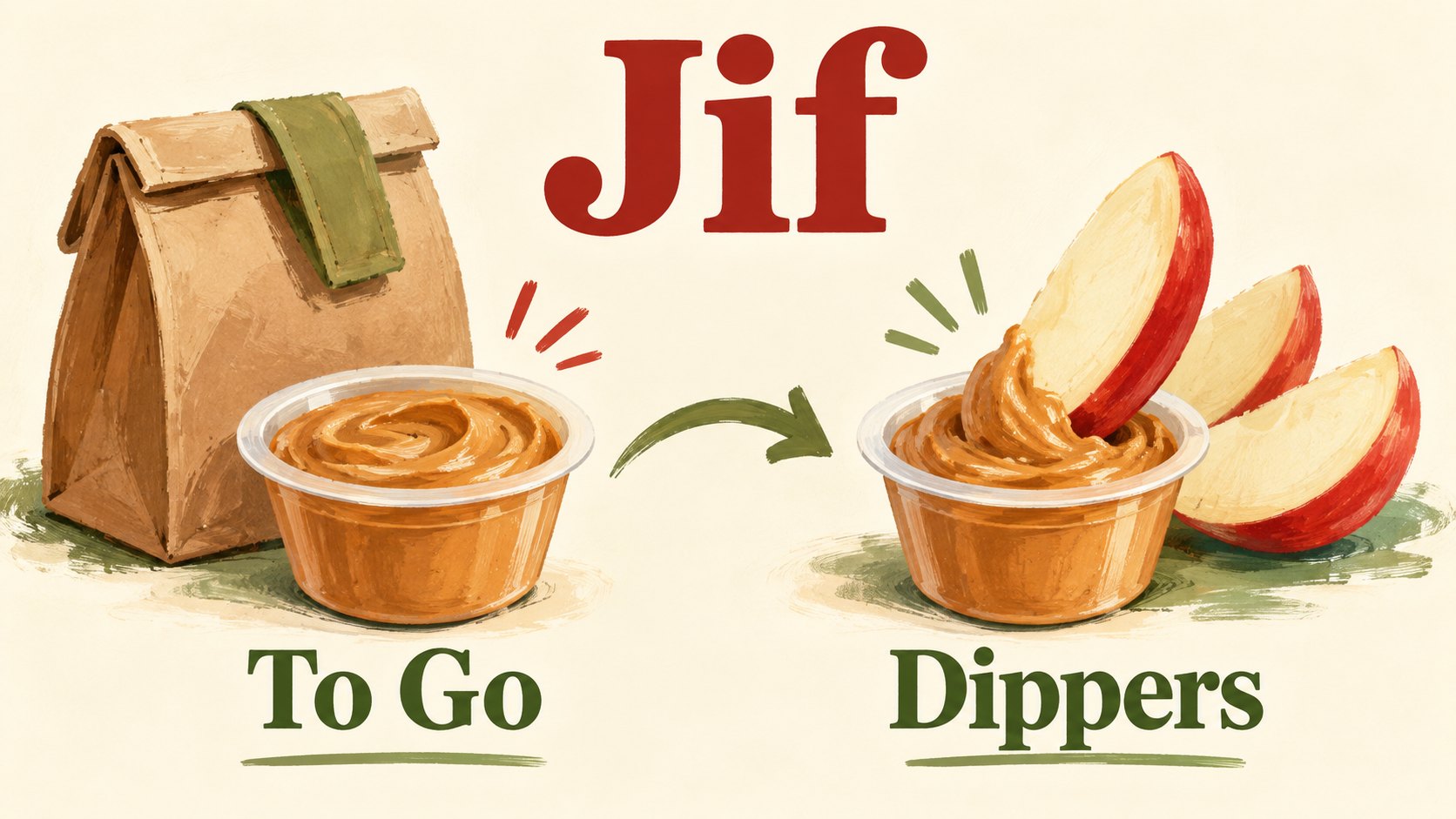
On 10 August 2026, The J.M. Smucker Co. announced what it called Jif's first major brand refresh in more than 30 years. It described an evolved three-colour banner, lettering without its drop shadow and packaging pictures showing more snack occasions. The portable Jif To Go range would become Jif Dippers; this was not a renaming of the main jar range.
Shelly Kowal, identified in the announcement as marketing director, framed the change around preserving familiar elements while reflecting a broader role in people's lives. New-look products would begin shipping in October, followed by a phased shelf transition through autumn and early winter. The company said the refresh did not change the product itself. These are the company's stated plans and assurances; they are not independent evidence of a completed rollout. Smucker's announcement.
That distinction matters now. A shipping date is not a promise that every shop already has the new jar. A design announcement is not a result. And an intention to encourage more uses does not show that customers have adopted them.
The package designer's more revealing explanation
Soulsight's own account describes work across the product family as well as the identity. Its stated aim was to modernise the brand without losing familiar visual signals. The agency describes food imagery that celebrates different ways to enjoy the product, connecting the new presentation to more snack occasions. Soulsight's project account.
The same post credits OH no Type Co. for a custom typeface and Mike Wepplo for product photography. It also discusses texture-inspired backgrounds and navigation across the range. That is first-person evidence of the design team's approach, not an independent effectiveness study.
These details change the subject. Instead of asking only whether the logo looks younger, we can ask what information the whole pack gives a shopper.
Which product is this? What might I eat with it? Does it belong to the range I already know? Is there a reason to choose this format for the occasion I have in mind?
The designer can arrange those answers. The designer cannot make the customer care about them. That is the tension behind the work.
Recognition and relevance are different problems
A visual identity carries memory. The name, colours and shape help a person connect today's object with previous experience. Packaging also carries instructions, sometimes without looking instructional at all. A food pairing can quietly suggest an action.
They can also conflict. Add enough new cues and the product may no longer look like the thing the customer intended to buy. Preserve everything and the new invitation may disappear into the old routine.
The challenge is not simply to choose between old and new. It is to decide which parts need to stay familiar so that another part can change meaning.
Why the name Dippers deserves attention
To Go describes portability. Dippers describes an activity.
That is our reading of the naming decision, not a quotation from a shopper study. Neither phrase is inherently better. They lead with different answers.
A person thinking about a lunch bag might find a portability message useful. A person looking for something to eat with sliced fruit might find an activity more immediate. One name says where the product can travel. The other suggests what to do with it.
This distinction is easy to miss when a redesign is reduced to a before-and-after logo image. It is also where the commercial thinking becomes more visible.
A name does not have to be clever to be useful. It may need to help someone recognise a situation quickly. The test is whether the wording resolves a real choice for the intended buyer.
There is a practical risk too. Existing customers have to connect the new name with the product they already know. A new name can clarify an occasion while briefly complicating a search. We have not audited Jif's retail listings; this is a transition question, not a reported problem.
The food picture is part of the proposition
Food photography is often treated as decoration: something delicious to make the pack attractive. In this case, it is worth asking what the picture tells a person to imagine doing.
A product shown alone answers a basic question about appearance. A product shown with another food can propose an occasion. It places the jar inside a small scene the customer might recreate.
The difference is between seeing an ingredient and imagining a use.
That does not mean any attractive pairing picture will work. The pictured action must be understandable at the size and distance where someone encounters it. It also needs to remain relevant to the product inside.
If the serving suggestion is hard to read, it may become colour and texture without a clear message. If it dominates the brand, the customer might see the snack but fail to find the familiar product. If the suggestion feels elaborate, it may make a convenient food look like another job.
These are questions for testing the actual pack. They are not defects established in Jif's redesign.
The interesting design opportunity is that the same small surface can identify the maker and demonstrate a possibility. The logo says who. The surrounding scene can help answer when.
A quiet launch can still attract useful discussion
Independent coverage confirms that the refresh caught editorial attention. The Independent reported the change on 14 August. Creative Bloq discussed it on 17 August, describing a restrained update that had attracted less fuss than more contentious redesigns. The Independent's report, Creative Bloq's design commentary.
That is evidence of coverage. It is not evidence that everyone is talking about Jif this month. We have not established a current Google Trends spike, a broad social surge or a change in buying behaviour.
The quieter nature of the story is part of its value. Dramatic rebrands supply an immediate plot: a familiar thing disappears, people react, management defends or reverses the decision. A restrained change asks the writer and reader to look harder at the business problem.
There is a danger in replacing one simplistic story with another, though. A quiet refresh is not automatically a good refresh. An angry response does not automatically prove a bad one. Public discussion can tell us what people noticed; it cannot answer every question about use or purchase.
Jif is worth considering because the intended action is legible. We can examine whether the identity helps teach that action.
The difficult part may be the transition
For a phased packaging rollout, the useful planning assumption is that customers may encounter different versions at different times. That could be a pack in a shop, a photograph on a retailer's website or a jar already at home. We have not audited Jif's channels to establish which versions are visible where.
Still, the transition raises a real question. Can both versions be understood as the same trusted product family without making every difference invisible?
Clear explanations and current pack photographs can help customers interpret a change. This makes the refresh a coordination exercise as well as a design exercise. It is a sensible place to look when later evidence arrives, without assuming either flawless execution or customer confusion.
What would count as a useful result?
The most visible result will be that the pack looks different. That is the least demanding test.
A stronger assessment would ask whether people can still identify the product, distinguish the versions they need and understand the suggested use. Those questions concern the pack's immediate job.
The next questions concern behaviour. Do customers try another occasion? Do they return to it? Is an apparent change related to the pack, or to distribution, promotions, price, advertising or other product changes?
Those are separate pieces of evidence. A person saying the new design is attractive does not establish a new habit. A rise in sales would not, on its own, isolate packaging as the cause.
We do not have the evidence needed to answer those questions for this refresh. No sales uplift, repeat-purchase improvement or return on design investment is claimed here.
That leaves room for a fair judgement about the idea. The work appears to address a specific gap between knowing a product and thinking of another use for it. It is a coherent hypothesis. A hypothesis becomes more convincing when observed behaviour supports it.
The strongest objection to the strategy
Perhaps the jar is the wrong place to teach a new habit.
A shopper who already knows exactly what they want may barely inspect the label. A person who does not want peanut butter may find that an appealing serving picture changes nothing. Other forms of communication may do more to demonstrate the use.
Those are reasonable competing interpretations. They challenge the size of the packaging opportunity without making the design pointless.
A pack can reinforce an idea encountered elsewhere. It can remind someone later, when the product is at hand. It does not need to explain a complete campaign by itself.
The opposite objection is also plausible: the change might be too restrained to register. Familiarity could protect recognition while hiding the invitation. That is another question to test, not a reason to demand a more dramatic logo on principle.
The right amount of change depends on what customers need to notice. Novelty is not an adequate substitute for that answer.
A useful lesson for smaller businesses
Time for Designs' practical interpretation starts with a question: what do customers already understand, and what useful thing are they missing?
If people know your name but do not know a relevant service exists, a wholesale identity change may not address the gap. Clearer wording or a well-chosen example may be more useful. If they cannot recognise the business across different materials, continuity may need attention first.
These are different briefs. Writing them down before discussing colours makes the design conversation more concrete.
Then identify the surface where the missing answer matters. A shop sign, printed leaflet, label and website may meet the same customer at different moments. Each has limited room and a particular job.
Finally, plan how the change reaches those surfaces. Keep the intended artwork, wording and approval clear. Consider whether existing materials still give customers a correct route during the transition. For readers working on physical materials, our business printing page is a relevant place to start a conversation about the printed part of that plan.
The purpose is not to copy a peanut butter brand's colours or food photography. It is to borrow the discipline of connecting a design decision to a customer action.
A familiar jar, a different question
Readers interested in the recognition question can continue with our account of Tropicana's packaging redesign. For the wider meaning customers attach to familiar identities, Cracker Barrel's logo backlash offers a different kind of tension. Neither story predicts Jif's result.
A missing shadow makes an easy comparison image. A new invitation makes a more useful business question.
When the product is already familiar, what needs to change so that people think of reaching for it at another moment?