
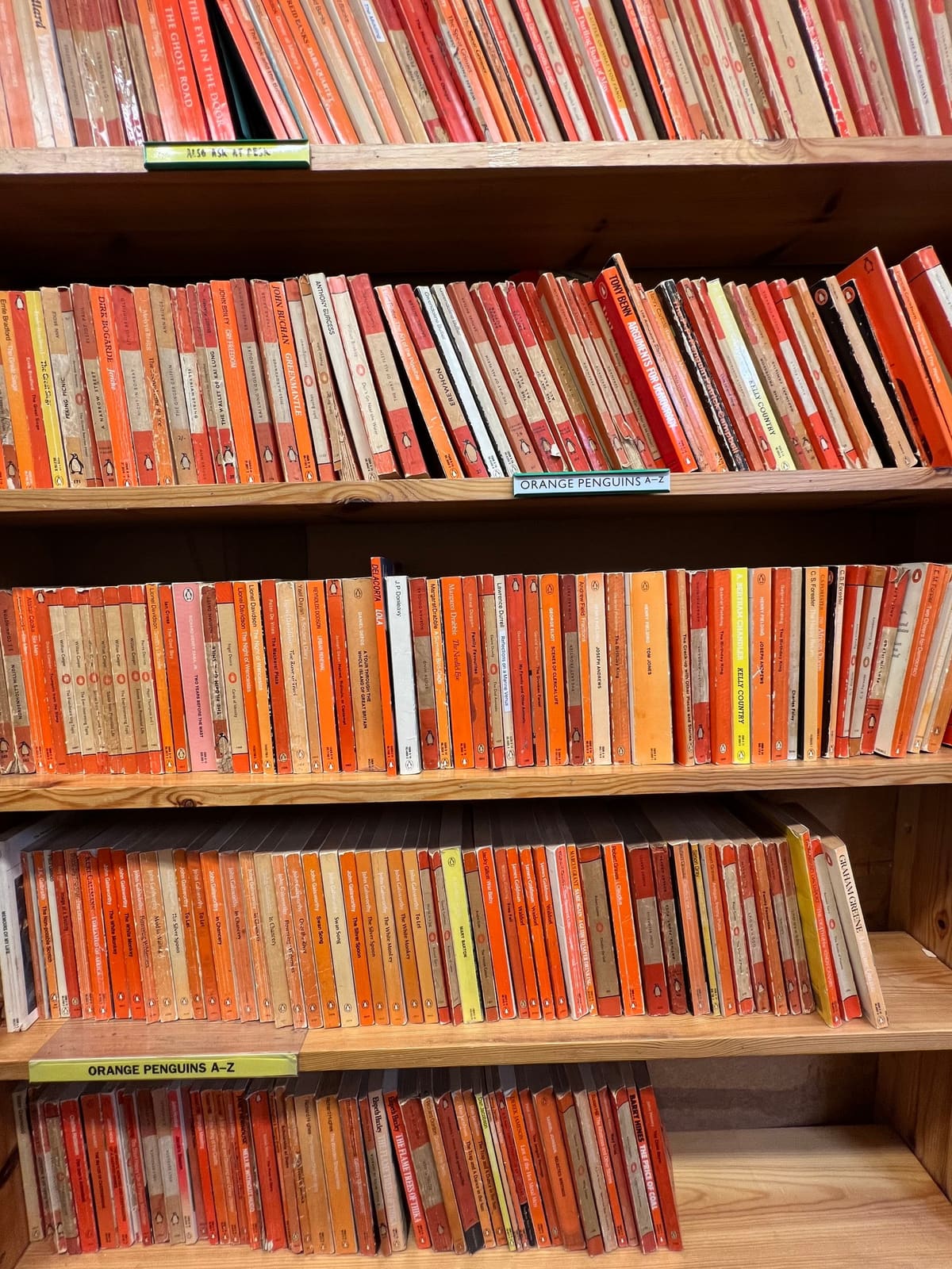

An orange paperback can be recognisable before you read its title. But Penguin's design history is more interesting than a colour that happened to stick. Different designers changed the covers, moved the lettering and made room for pictures. The difficult job was keeping a family resemblance while giving each book a reason to be picked up.
That is a useful problem to follow. A publishing series needs to say two things at once: this belongs with the books you already know, and this particular book contains something different. Too much sameness can hide the difference. Too much variation can hide the series.
Penguin did not solve that tension once and preserve the solution untouched. Its history offers several ways of deciding which parts should stay steady, which could change and how the decisions should survive the next production job. Those are different questions from choosing an attractive cover.
A paperback needed an identity of its own
Penguin was founded in 1935. The publisher's own history tells the familiar story of Allen Lane finding an unsatisfactory selection of books at Exeter St Davids station the previous year, after visiting Agatha Christie. It presents affordable good reading as the ambition behind the new paperbacks. Penguin's company history
That is the company's account of its founding idea, rather than evidence that a cover alone changed reading habits. Price, titles, distribution and production belonged to the offer too. The design had to make that offer visible without pretending the wrapper was the whole business.
The Design Museum describes the early scheme: Edward Young designed covers around horizontal bands, with orange identifying fiction, green crime and blue biography. Young also drew the bird that supplied the publisher's name with a visual character. Design Museum: Penguin Books
Consider what those decisions let a reader do. The title identified the individual work. The shared arrangement identified the publisher's family. Colour offered another clue about the kind of reading inside. The cover was doing several jobs with a limited set of repeated elements.
This is a distinction worth keeping. A repeated colour can attract attention; a meaningful system can help somebody choose. If the orange, green and blue are only decorative, they make a lively collection. If they consistently mean something, they also reduce the work needed to understand it.
The scheme was not an argument that every book ought to be orange. It was a way to combine a recognisable publisher with differences within the list. Remembering only the orange version loses part of the design decision.
A family resemblance is not yet a production rule
Put three related designs beside each other and it can be easy to see what connects them. Ask three people to make the fourth design separately and the connection may become less reliable.
One person puts the title slightly higher. Another changes the spacing to fit a longer author name. A third adjusts the logo to suit the available file. Each choice can seem harmless when considered alone. The set can drift even though nobody intended to redesign it.
The Design Museum describes Jan Tschichold's work at Penguin in the late 1940s as a move towards a more disciplined system. He specified title and author positions, brought front, spine and back into a coherent arrangement, and issued composition rules for the people setting and printing the books. The museum's account of Tschichold's approach
The useful mechanism is the handover from appearance to instruction. A designer can see that two pieces belong together. A rule helps the next person reproduce that relationship without guessing what the first designer meant.
That does not mean a template can replace judgement. A long title, an unusual image or a different format still needs attention. It means the attention starts from an agreed structure, rather than reopening every decision from scratch.
There is also a difference between a rule and a sample. A sample shows one successful answer. A rule explains which part of that answer must survive when the words change. Without that distinction, the next person may copy the wrong feature: the amount of empty space in a short title, for example, rather than the relationship between title and author.
The spine is a different design problem
A book cover is often discussed as though it is a flat rectangle viewed straight on. A bookshop or a bookshelf offers another view: a narrow spine among other narrow spines.
Penguin's account of its logo history includes designer Angus Hyland's explanation of the 2003 refresh. He describes a mark based on Tschichold's earlier bird, refined in response to inconsistent versions and the practical limits of paperback spines. Penguin's logo history and designer account
That account is valuable because it connects an identity decision to a particular use. The question is not simply whether a bird looks more elegant when enlarged on a screen. It is whether the identifying shape still works in the place where readers encounter it.
This is a common weakness in reviewing a design family: the most generous viewing condition becomes the approval condition. A large front cover makes the identity look clear. A spine, a small catalogue picture or a distant shelf may make different demands.
The same issue can arise with a business logo on a large sign and a small printed label. The two items do not need identical layouts. They need versions that keep the important identification clear within their respective limits.
Changing a detail for that purpose is not automatically abandoning consistency. It can be the work that makes consistency usable. The question is what remains recognisable after the adaptation, and whether the adapted version is approved rather than improvised repeatedly.
Pictures and a recognisable series can coexist
One tempting reading of the early Penguin covers is that recognisability depends on keeping illustration out. The later history does not support such a simple rule.
Penguin's own history of Modern Classics records the series' launch in April 1961 with Hans Schmoller's horizontal design. In October 1963, Germano Facetti retained its grey-toned colour relationship while adopting the Marber Grid, a layout developed for the crime books. It organised the information while giving more space to artwork. Designing Penguin Modern Classics
The important contrast is between the shared structure and the individual image. A grid can tell the reader where to look for the title while the picture tells them something about this particular book. One organises the family; the other creates a specific invitation.
The grid itself does not have to be visible as a collection of lines. It can operate through repeated edges, spacing and information positions. Readers may feel the relationship without naming its construction.
A series of identical pictures would miss the opportunity. A series with no stable information structure could make the reader start learning the cover again each time. The design task sits between those extremes.
For a business producing a series of brochures, the useful parallel is not to copy a Penguin cover. It is to decide whether the service name, practical summary and next step remain easy to find while the photograph changes to suit the subject. A consistent place for information can let the image vary more confidently.
Changing the letters changes the balance
The Modern Classics account also records a later typography decision: in March 1966, Joanna was replaced with Helvetica, and title and author information moved higher on the cover. The published history makes clear that the design developed through successive decisions, not a single timeless layout. Penguin's account of the 1966 change
It is easy to reduce that moment to a contest between two typefaces. But a typeface arrives inside a hierarchy. Its size, position, line breaks and relationship to an image all affect what the reader notices.
Changing the letters while leaving everything else untouched is one possible decision. Changing the relationship between words and pictures is another. They should not be treated as the same intervention merely because both appear on a cover.
For a reader, the result is encountered as a whole. They do not see the internal discussions about font choice or grid revisions. They see a title that is easy or difficult to find, an image that promises a particular story, and a mark that connects the book with its publisher.
This is why a design explanation is stronger when it describes the job being solved. Saying that a new typeface is modern is a style description. Saying that the information has been moved to create a stable reading order describes something you can inspect.
Familiarity does not mean freezing every detail
Across these examples, Penguin's identity survives through managed relationships: publisher and individual title, type and image, front and spine, shared rules and specific exceptions. There is no need to claim every redesign was equally successful to see the pattern.
A familiar design can become a constraint if the only instruction is never to change anything. It can also become meaningless if every new item is treated as a blank canvas. The useful question is which features do the work of recognition and which features do the work of distinction.
Think of those as two lists. Recognition might depend on an approved mark, an information order, a type relationship or a colour convention. Distinction might depend on the image, the particular words or a clearly defined category cue.
The lists should be tested against the actual collection. If the supposed identifying feature disappears on the spine, it is not doing that job there. If the supposedly variable feature contains the only clear service name, changing it carelessly may damage understanding.
This exercise is an editorial interpretation of the examples, not a reconstruction of Penguin's internal approval process. It gives a smaller organisation a way to inspect its own repeated material without assuming that famous design decisions transfer unchanged.
A practical way to review your own series
Start with three items that genuinely belong together. They could be three service leaflets, three event programmes or three editions of a catalogue. Do not begin by forcing unrelated materials into a family simply because they share a business name.
First, write the job of the series. What should somebody recognise across the set? What should they be able to distinguish within it? Those answers may be different. Recognising the organisation is not the same as choosing the correct service.
Second, mark the parts that are fixed and the parts that can vary. Replace vague instructions such as keep the look with usable descriptions: approved logo version, title position, minimum space around key information, and the way the category is written. A short rule that somebody can follow is better than a long statement of taste.
Third, try an awkward example. Use the longest genuine title, an image with a different shape, or a version with more necessary information. If the system only works for the easiest item, it is still a sample rather than a dependable series design.
Fourth, inspect the less generous views. Look at the finished size, a small image of the item and the part someone may see first. A beautifully balanced spread does not prove a folded front panel is useful. Do not enlarge the preview until every detail becomes easy and then call the small version checked.
Finally, record an approved example and the reason for any exception. The record should let the next person distinguish a deliberate adaptation from an accidental departure. Otherwise, the exception can quietly become the new default.
Our guide to keeping branding consistent across printed materials develops that practical record. If you are preparing a connected set of printed pieces, Time for Designs' printing information is a useful next step for discussing the formats and artwork involved.
The more interesting achievement was a system that could change
Penguin's covers are memorable, but the story is not just about making one memorable object. It is about organising many different objects so that each remains useful and the collection remains recognisable.
Young's early bands, Tschichold's production rules, the room made for artwork and the attention given to a narrow spine answer different parts of that problem. None makes the others unnecessary. A strong mark still needs a usable placement. A usable grid still needs a truthful title and a fitting image.
The practical lesson is to make sameness earn its place. Keep the features that help people recognise and understand the collection. Let the features that explain the individual item do their work. Then write enough of the decision down that the next edition does not have to guess.
Sources and reading notes
This article uses Penguin's published accounts and the Design Museum's collection-based history. Publisher accounts explain the organisation's own story and design intentions; they do not prove sales effects. The sources differ on some details, including the size of the first launch list, so no number is asserted here. Dates refer to historical designs, not a claim that every present Penguin book uses one layout. The series-review exercise is Time for Designs' editorial analysis, not a reported customer project.