
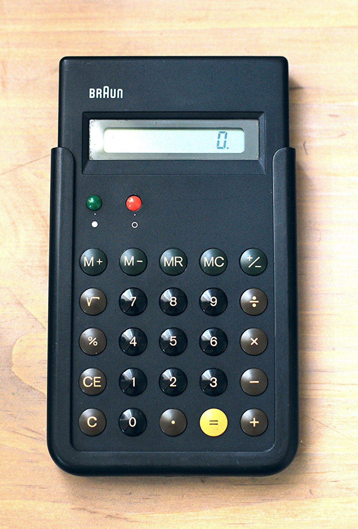

The yellow button is almost the last thing on the Braun ET66, but it is one of the first things you notice. It sits near the bottom of a field of black and brown circles. On it is a single black equals sign.
There is no arrow pointing towards it, no decorative border and no instruction telling you that the calculation ends here. The colour makes a distinction that the surrounding controls do not share.
Then other distinctions emerge. Green and red buttons sit apart from the main keypad. The digits occupy a compact block. Mathematical operations run down the right. What first looks like a restrained black rectangle turns out to contain several overlapping ways of explaining itself.
First, which Braun calculator?
The ET66 is a 1987 design. Both the Centre Pompidou’s collection record and Frankfurt’s Museum Angewandte Kunst name Dieter Rams and Dietrich Lubs as its designers. Braun is the manufacturer.
That model number matters because another familiar Braun calculator sits nearby in design history. MoMA’s ET55 is dated 1980, not 1987. Calling any black Braun pocket calculator the ET66 turns a family of objects into one supposedly unchanging design.
Credit needs similar care. Vitsœ, the furniture company closely associated with Rams, captions its ET66 example as a design by Lubs. The museum catalogues credit both men. The useful conclusion is to keep Lubs visible alongside Rams, rather than invent a private division of their work from those short labels. Vitsœ’s principles page and ET66 caption give readers the comparison.
The calculator becomes more interesting once it is allowed to be a particular object, made within a continuing design practice. Its clarity did not arrive without predecessors.
The yellow key was already there
The Stewart Program’s ET22 record dates that earlier model to 1976. It already has white numerals on black buttons, functions identified on brown buttons and a black equals sign on yellow. The colour relationship was established well before the ET66.
That earlier record lets us separate an inherited idea from the particular arrangement shown here. On the ET66, the separate green and red power buttons leave a substantial gap above the regular round keypad.
This is a useful way to see refinement. The later object does not need a completely new visual vocabulary to look more settled. Repeated circles and a regular arrangement give its controls a common structure; placement and colour then distinguish their jobs.
The family resemblance also explains why the yellow key can act as more than an isolated accent. It belongs to a repeated way of presenting calculation. Recognising that relationship is different from claiming that every user immediately understands every function.
A small map for the fingers
Look at the ET66 photograph from the display downwards. The two power buttons occupy their own area. Below them, the keypad begins with memory controls and a change-sign key. The familiar rows of digits sit underneath, while the arithmetic operators form the right-hand column.
The organisation gives different kinds of information different places. You can look for a number within a block or an operation along an edge. You do not have to treat each key as an unrelated mark scattered over the surface.
The equals key complicates that order just enough. It has the same round outline as its neighbours, but its yellow face interrupts the darker field. One physical shape can therefore support a consistent rhythm while one colour marks a different role.
This is our reading of the visible layout, not a timed usability test. The point is observable without inventing a result: shape makes the keys look related; position and colour divide them into useful groups.
Nor is the calculator empty of functions. The photograph shows memory keys, a square-root symbol, a percentage key and separate clearing controls. Its quiet appearance comes from arranging that variety, rather than removing everything beyond addition.
The circles are not only graphics
A photograph can make a keypad look like a pattern printed on a flat sheet. The reflections on these keys reveal something else: their surfaces curve outwards.
The Museum Angewandte Kunst’s account of the ET66 identifies the buttons as convex and connects that shape with more comfortable operation. It also describes the functional colour groups and the short instructions on the reverse.
There are two encounters with the design here. The eye chooses a control; a fingertip then meets a shaped surface. Reducing the calculator to its palette would miss the second encounter. A convincing picture of the keypad is not the same thing as using it.
The instructions on the back are a revealing detail too. A clearly organised front and written help can coexist. Good arrangement can make ordinary actions apparent without making every less-familiar symbol self-explanatory to every person.
The part that disappears in a front view
A pocket object also has to survive the moments when nobody is calculating. The Powerhouse’s ET66 collection entry includes the calculator, its case, instruction leaflet and original packaging. A separate record describes the black plastic hard case.
The case changes how we read the object. A front-facing photograph concentrates attention on the display and buttons. A cover belongs to another part of its life: being put away, carried and brought out again.
In his 2011 account of owning an ET66, Vitsœ managing director Mark Adams singled out that case when explaining why his calculator remained in daily use after 24 years. He also described the ribbed back and small rubber feet. That is one owner’s experience, not a lifespan guarantee, but it directs attention beyond the celebrated face.
Those less-photogenic surfaces matter to the story. The calculator is both a readable arrangement and something to handle, rest on a desk and protect. The visible order is part of a physical object, rather than a composition whose job ends when it has been admired.
A principle you can point to
Vitsœ places its ET66 photograph beside Rams’s principle about attention to detail. Elsewhere on the same page, his principles distinguish usefulness, understanding and restraint. They describe tools that should serve their purpose rather than demand attention for their own sake.
The calculator gives those ideas something specific to attach to: the isolated power controls, the grouped digits, the raised keys and the one conspicuous yellow circle. They are decisions that can be examined separately, not merely signs that the object belongs to a fashionable category called minimalism.
Its restraint is also selective. Making every key black would produce a more uniform picture, but it would erase some of the distinctions we have been following. The most striking colour on the object is doing a job inside that quiet arrangement.
That is what makes the ET66 worth looking at for longer than a glance. The front gives a calculation a visible order; the curved surfaces and case carry that order into use. The calculator does not become simple by having nothing to explain. It makes several kinds of information fit together, then lets the yellow key stand apart.
Sources and scope
The linked museum records establish model dates, catalogue credits and object details. Vitsœ supplies Rams’s principles and its Lubs attribution; Mark Adams supplies the explicitly attributed owner account. Discussion of the photographed layout is editorial analysis. The 2014 photograph is not evidence that this particular specimen was manufactured in 1987, and no hands-on test, sales result or Time for Designs customer experience is claimed.