
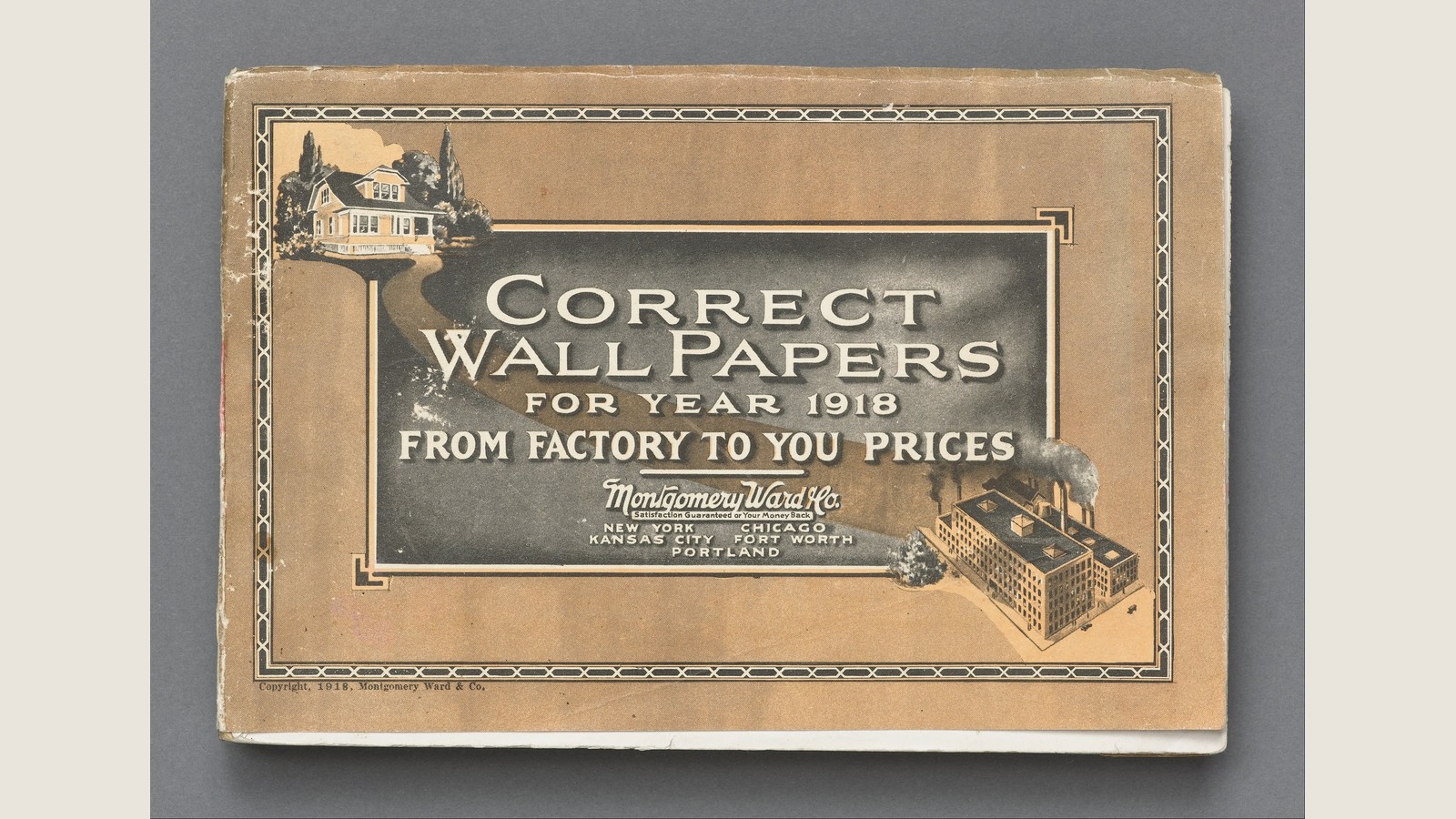

A house sits in the upper-left corner. A factory occupies the lower right. Between them, a dark rectangular panel carries the promise “From Factory to You Prices”. A tan ribbon sweeps around the panel, linking the two pictures.
Montgomery Ward’s wallpaper book is selling a connection before the reader has seen a pattern.
The year is not something a modern caption has guessed. The cover says 1918, and a small copyright line repeats it. The collection information accompanying this reproduction identifies the object as Correct Wall Papers for Year 1918, a sample book held by Cooper Hewitt, Smithsonian Design Museum.
Its worn corners make it look like an ordinary survivor. Yet the arrangement is carefully argued. A home, an industrial building, a promise about price and a guarantee all have different work to do.
The customer has already been given a place in the picture
The illustrated house has a porch, windows, a roof broken into several shapes and trees around it. It is a recognisable domestic destination rather than a diagram of a room.
That choice matters on a book about wall coverings. The cover does not begin with a close-up of a roll or a set of abstract repeat patterns. It places the product inside the larger idea of a home.
At the opposite corner is an illustrated industrial complex. Its rows of windows, long rooflines and chimneys give it a different scale and purpose. It represents the other end of the relationship the wording proposes.
Read the two pictures together and the little word “you” acquires somewhere to live. The reader is invited to connect the domestic scene with the source of manufacture.
This is a reading of the cover’s composition. It does not tell us who owned the pictured house or whether the factory drawing records a particular building. Neither identity needs to be invented to see the visual relationship.
The connecting ribbon turns two buildings into a route
The house and factory are not placed in two matching boxes. A tan ribbon slopes and sweeps around the rectangular title panel. It draws the eye between their corners while the price wording runs horizontally.
There is no delivery van, railway wagon or postal worker completing the journey. Instead, the cover supplies two endpoints and lets its words join them.
That is an economical way to make an argument. A product heading tells us what is offered. A route suggests how the seller wants the offer understood.
The word “from” is doing as much work as the factory. It asks the reader to think about an origin. “To” moves the promise towards a recipient. “Prices” makes that proposed relationship a commercial advantage.
Notice the limit of the evidence. We can identify what the cover claims. We cannot establish its actual supply chain, costs or savings from the illustration. A printed factory is not an audited explanation of a price.
Keeping those things separate makes the design more interesting. The cover compresses a proposition into a few words and two pictures; it does not need to document every stage to communicate the proposition.
“Correct” sells judgement as well as wallpaper
The book calls its contents “Correct Wall Papers”. That is a more loaded description than simply naming the material.
“Correct” suggests a choice that will be appropriate. On this cover, the suggestion sits beside the image of a house, so the promise is not merely that paper exists for purchase. It is that the collection belongs in a setting the reader can imagine.
The date adds another layer. These are papers “for Year 1918”. A dated selection can be presented as current for its particular moment. That is different from claiming the patterns are timeless.
We have not opened the full sample book here, so the cover cannot support a description of all the designs, the range of colours or the ordering instructions inside. Those would require the corresponding pages.
What we can see is the threshold the reader crosses before reaching them: product, judgement and a named year. The cover prepares a way of looking at the collection.
The guarantee answers a different question
Beneath the Montgomery Ward name is a much smaller line offering satisfaction or money back. Its job differs from the large price promise.
A price claim asks why this seller might be attractive. A guarantee addresses what happens if the purchase disappoints. Both can matter when a reader is considering an object through a printed representation.
The hierarchy keeps them from competing equally. The product title is large. The factory-to-customer claim follows. The business name and guarantee form a more compact group underneath.
The wording on this particular cover is evidence of an offer being communicated, not proof of the conditions applied to every transaction or how every return was handled. The small line should not be expanded into a history of customer outcomes that the object does not provide.
It nevertheless changes the character of the page. The cover does not rely on an attractive house alone. It combines aspiration with a practical assurance, using different sizes of type to give each a place.
Five cities make distance part of the identity
New York, Chicago, Kansas City, Fort Worth and Portland appear beneath the signature. They add a geographical presence to the named business.
The list does not identify the reader’s town. It identifies places associated with the seller on the cover. Their presence strengthens the impression of an organisation extending beyond one small shopfront.
Again, there is no need to invent what each location contained in 1918. A warehouse, office, factory and retail premises are different things. This cover does not label each city by function.
The interesting contrast is visual: one domestic building is paired with a factory, while the business name is supported by several place names. The customer’s imagined destination is simple; the seller’s presence is dispersed.
The cover makes that distance feel organised rather than leaving it as an unexplained gap.
A surviving object lets us read the promise slowly
Viewed quickly, this is a handsome old trade book. Viewed more slowly, it contains several linked propositions: a home worth furnishing, a source of manufacture, a price relationship, a dated selection and a reassurance about satisfaction.
The border holds those elements together. The title panel gives them an order. The pictures keep the argument from becoming only a block of sales wording.
Its age does not prove the promise was successful, and its wear does not tell us how a particular household used it. Those are questions for different evidence.
What survives on the cover is still enough to show a specific design decision. Montgomery Ward did not simply put wallpaper on the front of a wallpaper book. It put the buyer and the proposed source on opposite corners, then made the space between them the selling point.
Source and image
This close reading uses the original cover visible in the linked public-domain reproduction and its collection metadata. The image credit identifies the museum object and the resizing. The inside pages, individual buildings, actual savings and fulfilment outcomes have not been independently examined and are not claimed here.