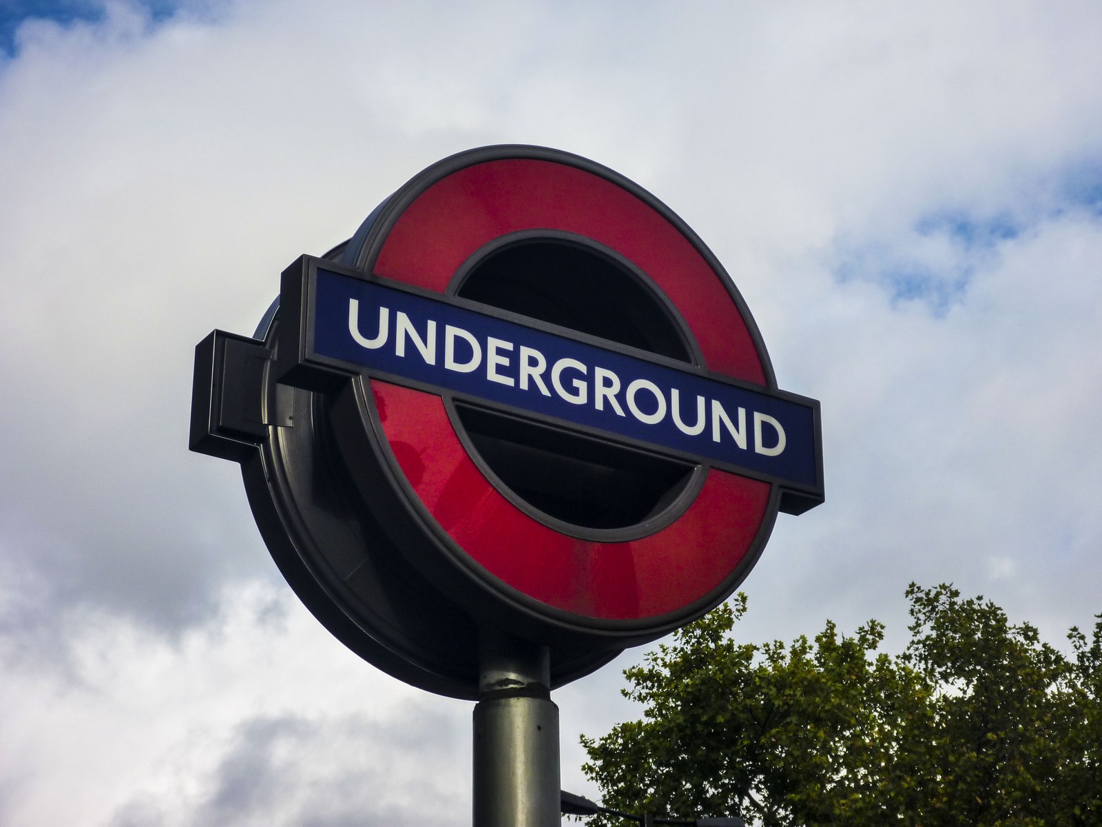
The lettering above a London Underground entrance looks as though it belongs there. That familiarity can hide a more interesting story: keeping Johnston recognisable has involved changing how it works.
A typeface drawn for a railway in the early twentieth century eventually had to serve digital communication too. The question was no longer simply which letters to draw. It was how much could change before London stopped recognising its own voice.

A common alphabet for a sprawling presence
TfL Corporate Archives’ account of Johnston dates the commission to 1913. It records delivery of uppercase letters in June 1916, followed by lowercase letters and numerals that July. A complete printer’s set followed in June 1917, supporting use across posters, notices and other printed material.
Those are different moments. A drawing delivered to a client is not yet a whole organisation speaking through it. An alphabet has to become something people can set, reproduce and put to work in many messages.
It is easy to notice the prominent name on a station sign and overlook the smaller information around it. Yet a transport identity cannot live on one impressive word. It has to accommodate destinations, directions, explanations and the ordinary language of a journey.
A consistent letterform offers a visual relationship between those messages. It does not supply the route or make every sentence clear. It gives otherwise separate pieces of information a shared manner of appearing.
The problem was larger than the shape of a letter
The archive describes a 1979 identity review that found practical limits: too few fonts and sizes, wide spacing, and dependence on expensive, disappearing hand-setting skills. It also records recognition of the lettering’s organisational value. Eiichi Kono developed New Johnston between 1979 and 1983.
That combination matters. The account does not describe an identity with no remaining value. It describes valued lettering attached to a way of working that needed attention.
There are two tempting readings of such a problem. One is that old design has become an obstacle and should be replaced. The other is that familiarity must be protected by refusing change. Johnston’s history makes room for a third: preserve the relationship people recognise while revising the means of producing it.
A typeface is more than a picture of an alphabet. Someone must choose a weight, compose a line and make a readable message within the space available. A family with insufficient options can restrict that work even when its best-known letters remain admired.
This does not establish that every historic identity deserves preservation. It explains why the decision cannot be made from a specimen sheet alone. The letters’ cultural role and their practical range can pull in different directions.
A familiar voice encounters new characters
The archive identifies another review in 2016, resulting in Johnston100 and including symbols such as # and @. The expanded communication task was visible in the character set itself.
Those symbols are small, but the problem they represent is substantial. A typeface associated with transport still needs to express the messages its organisation now sends. Recognition is not enough if the working family cannot comfortably carry the required language.
Monotype’s account of the commission describes demands ranging from station maps to mobile apps. It says Johnston100 introduced five weights, including Hairline and Thin. The designers, Nadine Chahine and Malou Verlomme, studied archive drawings and revisited features including the diagonal bowl of the lowercase g and a wider uppercase U.
This is the commissioned designer’s explanation of its intentions, rather than an independent test of passenger comprehension. It nevertheless reveals a specific tension: extending the family while also recovering details that earlier adaptation had softened.
The direction of change was not simply towards something newer. Looking backwards became part of making a typeface usable in a newer environment.
Restoration and invention can happen together
Adding a weight and recovering a letter’s particular shape address different questions. One expands what the family can do. The other concerns what makes that family itself.
Put together, they complicate the usual before-and-after story. An updated design can contain both new provision and a return to older character. Calling the result a complete reinvention would miss the continuity; calling it unchanged would miss the labour.
Nor does more range mean every weight belongs in every setting. A thin letter used in one context does not automatically replace the weight needed for another. A family supplies choices; its use still requires decisions.
London Underground’s Station Design Idiom places Johnston alongside the roundel and Tube map as parts of a wider identity. It describes the lettering’s intended qualities as calm and legible. Those are design aims, not evidence that lettering alone solves a complete wayfinding task.
The continuity is in the work, too
Look again at the word over an Underground entrance. The visible sign is one moment in a longer chain: drawings, type production, reviews, revised families and repeated applications.
That is what makes Johnston’s survival more satisfying than a simple story of a design untouched by time. Its persistence has required people to distinguish what could be adjusted from what gave the lettering its character.
The achievement is not that London never changed its letters. It is that changes in the letters’ working life could remain part of a recognisable London.
Sources: TfL Corporate Archives, Monotype’s commissioned-design account and London Underground’s Station Design Idiom, linked beside the relevant passages. The photograph shows a genuine 2009 sign, not a specimen of the 2016 revision.