Toblerone kept its triangles. It was the space between them that made people angry.
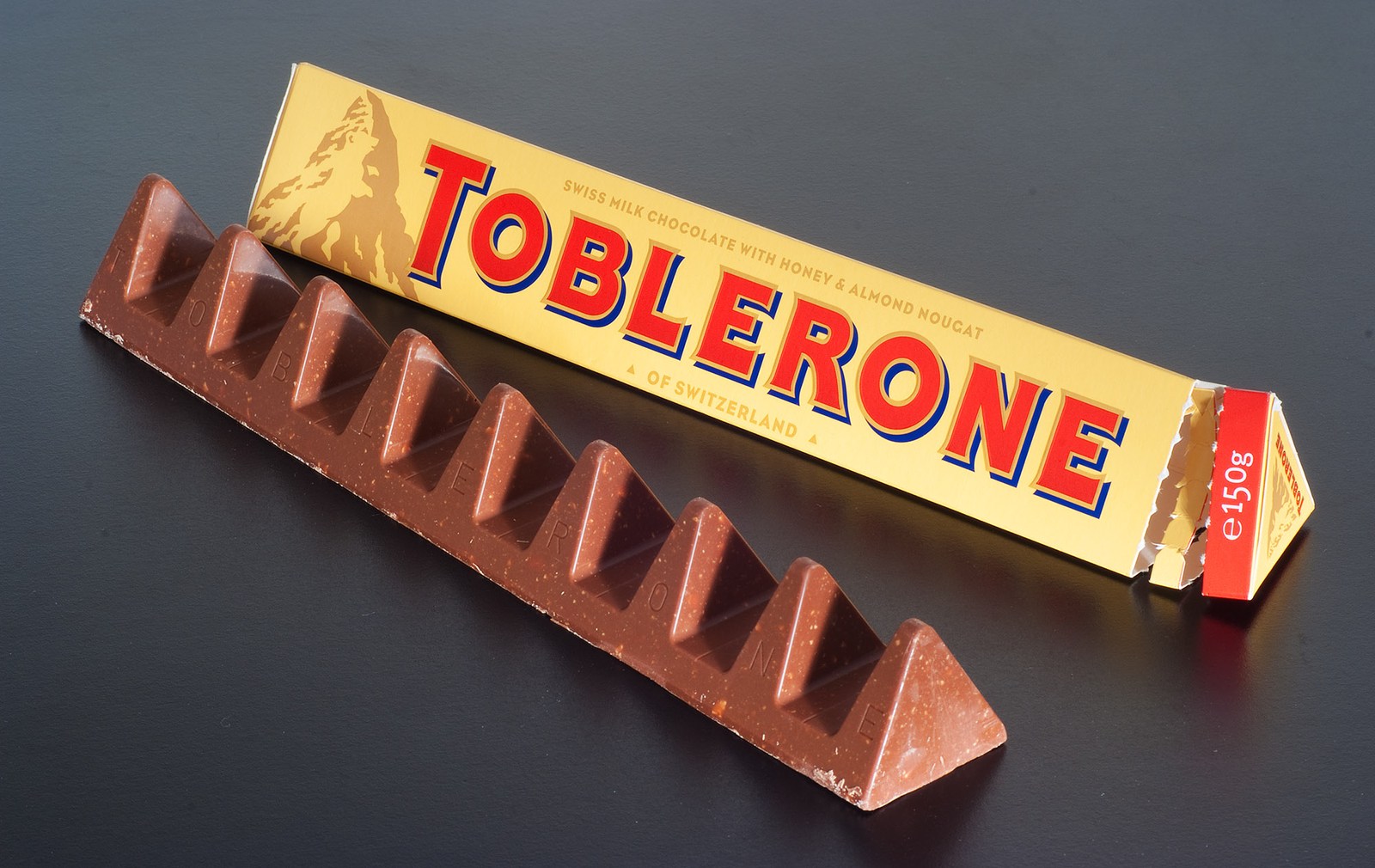
In November 2016, a familiar chocolate bar became a very visible argument about getting less. The package still had its long triangular form. Inside, the chocolate peaks stood farther apart. A cost decision had acquired a shape that anyone could discuss without reading a balance sheet.

The reduction had a conspicuous outline
The BBC’s contemporaneous report of 8 November 2016 recorded two weight changes: 400g became 360g, and 170g became 150g. The package size stayed the same. Mondelēz said higher ingredient costs lay behind the decision and presented the altered shape as a way to keep the product affordable.
Those are two different reductions: 40g from one bar and 20g from the other. They should not be turned into a claim that every Toblerone everywhere suddenly lost the same percentage of chocolate. The report concerned two formats sold in the UK, within a larger range.
The striking detail was how the reduction appeared. A shorter bar would have announced less through length. This one announced less through interrupted rhythm. Peak, gap, peak: the repeated element was still recognisable, but its relationship to its neighbours had changed.
That distinction explains the visual force of the photograph. The empty parts are not an abstract number on a wrapper. They are visible beside the chocolate somebody expected to eat. No specialist knowledge is needed to notice them.
A familiar shape is more than one triangle
There is a narrow way to describe the design: Toblerone remained triangular. There is a more useful way to look at it: the identity belonged to the complete row, including the spacing, repetition and proportions.
Imagine hearing a familiar tune with longer silences between its notes. The notes can all be correct while the experience changes. The comparison is an interpretation of the design, not evidence from a consumer experiment. It helps explain why retaining a component does not necessarily preserve the whole.
The wrapper and product also created two different expectations. The outside retained a familiar scale. Opening it revealed a different distribution of chocolate along that scale. That does not establish a legal conclusion about the pack, and it does not mean the declared weight was hidden. It identifies the moment at which the visual experience could disagree with a remembered one.
A small printed quantity and a large physical outline do different work. One supplies an explicit measurement. The other supplies an immediate impression. In this case, the gap between those kinds of information became unusually easy to photograph.
The public response was not unanimous
The BBC’s contemporaneous account of the response reproduced complaints about the wider spaces, including suggestions that the bar should have been shortened instead. It also included a customer who welcomed the company explaining its decision publicly. These are documented reactions, not a representative opinion poll.
That qualification matters. A collection of memorable comments can establish that criticism occurred. It cannot tell us what proportion of buyers objected, how many changed their purchases, or what the decision did to profit. We have not found evidence here that isolates those outcomes.
Some coverage and commentary connected the story with Brexit. The company spokeswoman quoted by the BBC explicitly said the change was not made as a result of Brexit. Ingredient costs were the company’s explanation; a confident claim that one political event caused this particular design decision would go beyond the evidence used here.
The story is already interesting without that extra certainty. A manufacturer described a cost problem. Some customers answered with a design objection. They were responding to different parts of the same decision.
What ended in 2018?
In July 2018, ConfectioneryNews obtained a response from Mondelēz spokesperson Laura Flynn: the 150g bar was no longer being manufactured, and remaining availability depended on retailers’ stock. She described that format as a temporary response to cost increases and manufacturing constraints.
This is firmer evidence than simply repeating a headline about the original bar returning. It tells us which format had stopped being made and how the company described its role. It does not establish that every altered bar was withdrawn simultaneously, or that the precise former 170g offer returned unchanged.
The trade report also distinguished confirmed information from speculation about a replacement and its price. That separation is worth preserving. A proposed replacement, a company-confirmed withdrawal and a shop’s remaining stock are not the same event.
Nor does a later change prove a single cause. Criticism is part of the record. The company’s stated constraints are part of the record. The evidence presented here cannot quantify how much each factor contributed to the decision to stop manufacturing the 150g version.
The gaps became the story
The episode is often reduced to a simple instruction never to change a familiar product. That misses what makes this particular change memorable. Products change all the time. Here, less product took a form that made the absence conspicuous.
The peaks remained, so recognition survived. The spacing changed, so the experience did not remain intact. Both observations can be true. Identity is not an inventory in which retaining the logo, colour and one geometric feature automatically preserves everything a buyer remembers.
Toblerone’s later Matterhorn packaging change raises a different question about what an image communicates. The 2016 episode concerns the geometry of the product itself. One changes the meaning of a picture on a package; the other changes what appears when that package opens.
The most revealing feature in the 2016 photograph is therefore not a missing logo or a new colour. It is the dark surface showing between familiar peaks. The decision did not remove the triangle. It changed what people saw around it.
Sources and scope
The BBC report supplies contemporaneous company explanations and contrasting public comments. ConfectioneryNews supplies the named spokesperson’s 2018 response. The photograph is a licensed contemporary image, not a reconstruction. Visual interpretations are ours; sales effects and the relative influence of criticism are not established here.