
When a colour becomes associated with a whole category, abandoning it is one possible response. Nubank took another route: keep purple, refine it, and ask more of the other parts of the brand.
In Fast Company’s 29 October account, co-founder Cristina Junqueira describes the problem of brand attributes becoming category attributes. Arthur Foliard, executive creative director at Koto, points to purple’s spread through financial technology. Their answer was not to treat colour as the brand’s only recognisable ingredient.
That makes this refresh more interesting than a before-and-after logo comparison. The familiar Nu remains, while the surrounding design has to accommodate more expressions, sizes and situations. Design Week’s 3 November coverage brings that wider system into view.
The useful question is what changes when a brand stops asking one colour to do all the identifying.
A familiar colour can be valuable without being exclusive
The tension begins with two different kinds of familiarity. Purple can remind someone of Nubank. It can also remind them of a wider field of digital financial services. Those associations are not necessarily mutually exclusive.
Leaving the colour would create a different problem: the company would give up a familiar cue in order to escape a less distinctive category. Retaining it leaves the work of differentiation to a combination of elements.
That is our reading of the decision described in the coverage. It is not a measured comparison of competing banks’ palettes or evidence that every viewer identifies the colour in the same way.
The distinction matters because a brand is encountered in pieces. A colour may be noticed before the name. Letter shapes may remain visible when an image changes. A small symbol may appear far from a full campaign layout.
No single piece has to carry the whole identity equally well in every setting. But the pieces need to support one another. In Nubank’s case, keeping purple makes the relationships around it more important.
The square lets the mark bring its colour along
Nubank’s own explanation of the refresh describes a preferred version of the logo inside a purple square. The company’s stated reason is direct: the mark takes purple with it, including when it appears on another organisation’s background or a white screen.
This is a small change in how the mark is used, with a larger consequence for its surroundings. A free-standing symbol depends on the surface behind it. A contained symbol arrives with a defined patch of its own environment.
The square therefore does more than make an icon-shaped object. It joins two recognition cues that might otherwise separate: the Nu form and the colour field.
It also changes the design question. The issue is no longer simply whether a logo can be placed over a particular photograph or background. The mark can retain an immediate piece of context while the larger image carries something else.
The company says the logo was refined, rather than replaced. The distinction is useful here. Preserving a recognisable identity does not mean that every curve, colour value or usage rule has been frozen.
The lettering carries a family resemblance
Type extends that relationship into material too long to fit inside a logo. Nubank’s account of Nu Sans says the family draws on the curves and connection between the n and u of its mark.
There is a different kind of continuity in that decision. A logo can identify the source of a message. A related typeface can influence the appearance of the message itself, including words that have nothing to do with the company’s name.
The system separates Nu Sans Display, intended for expressive headings, from Nu Sans Text, intended for reading and interfaces. A large headline and a dense screen of information do not ask the same thing of a letter.
At one scale, a curve can supply personality. At another, a reader needs to distinguish characters quickly and follow a line without distraction. The family relationship allows different treatments to belong together without making them identical.
This is a more demanding form of consistency than putting the same large lettering everywhere. It asks the underlying character to survive a change in job.
Some of the important changes are measured in width
The company’s type account also describes decisions that are less obvious in a campaign image. Nu Sans Text was designed with metrics close to the app’s previous typography. It includes tabular figures for aligning columns of numbers, and features intended to keep widths stable when text changes weight.
These are reported design intentions and implementation claims, not results from an independent test of the app. They nevertheless identify a practical problem that an attractive specimen cannot show on its own.
Change the width of text and the words may wrap differently. A line that once fitted can become two. A heading made bold can displace the material beside it. A column of numbers can be harder to scan if the digits do not occupy matching widths.
That makes continuity a matter of behaviour as well as appearance. The letters can acquire a new character while the layout aims to remain predictable.
The contrast with the purple square is revealing. One device makes recognition more visible. The other tries to stop a change from becoming disruptive. Both belong to the same refresh, even though only one is likely to dominate a thumbnail.
A family does not have to speak at one volume
The wider identity also has to leave room for differences within Nubank. Koto’s primary case study presents Croma as a more expressive, colourful identity and Ultravioleta as a more refined expression. Both are connected to the broader Nu system.
This is where “keep purple” becomes too small a description of the work. A family can preserve shared ingredients while changing emphasis, spacing, imagery and tone. Recognition need not depend on every surface having the same density or energy.
The challenge is to make the relationship available without erasing the distinction. If everything looks identical, the family has no room to express different purposes. If everything changes at once, the connection becomes harder to see.
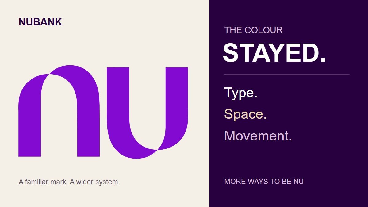
The case study shows the question extending beyond a mark and a palette. It brings together large campaign typography, photography, illustration and digital applications. Readers can inspect those actual examples in the linked primary reference; the editorial image above uses the earlier 2021 Nu mark, not a reconstruction of the new system.
One advantage of looking at the whole case is that it shifts attention from isolated assets to their combinations. A colour can recur while the surrounding material changes. Type can supply continuity when the photograph is different. The mark can stay compact while a headline becomes expansive.
A simple-looking result still contains rules
Koto describes a graphic system built from colour, modules and layers, with motion extending the same logic into larger brand moments and smaller app interactions.
That is a useful way to understand the scale of a refresh. The output may look less complicated than the decisions required to make it repeatable.
A purple square is simple to recognise. Deciding where it belongs, how much space it needs and what can vary around it is a system. Two related type treatments are easy to name. Making them work across large messages and small interface text requires different kinds of judgement.
The restraint is therefore not an absence of design. It is a choice about where variation should happen and where it should stop.
There is also a limit to what the case study can establish. A documented system shows how the creators intend the parts to work together. It does not prove that recognition, accessibility or customer experience has improved in every market and application.
What it does provide is a set of concrete decisions to examine, rather than a broad claim that the brand now feels more global.
Keeping purple made the rest of the system matter
Nubank’s refresh starts with an apparent refusal to make the most obvious change. The colour remains in the family. The Nu identity remains recognisable.
The interesting work then spreads outwards. The square carries colour into unfamiliar surroundings. The typeface takes cues from the mark but adapts to different reading tasks. Text metrics address the continuity of layouts. Different expressions within the family gain room to feel distinct.
That combination is the point of the story. A familiar colour can remain useful even when it is no longer enough on its own. The refresh gives the other parts of the identity more responsibility for making the whole feel like Nu.
Sources and scope
Koto’s case study and Nubank’s refresh and Nu Sans pages are primary accounts of design intentions. Fast Company’s 29 October and Design Week’s 3 November reports supply recent independent coverage. The company pages currently display earlier 2026 dates; no archived versions were examined, so those dates do not establish when every current detail first appeared. This is a look at a 2026 system receiving fresh coverage, not a claim of a new 6 November launch. Analysis is Time for Designs’ interpretation. No firsthand app test, fraud-prevention finding, financial recommendation or measured commercial result is claimed. Checked on 6 November 2026.