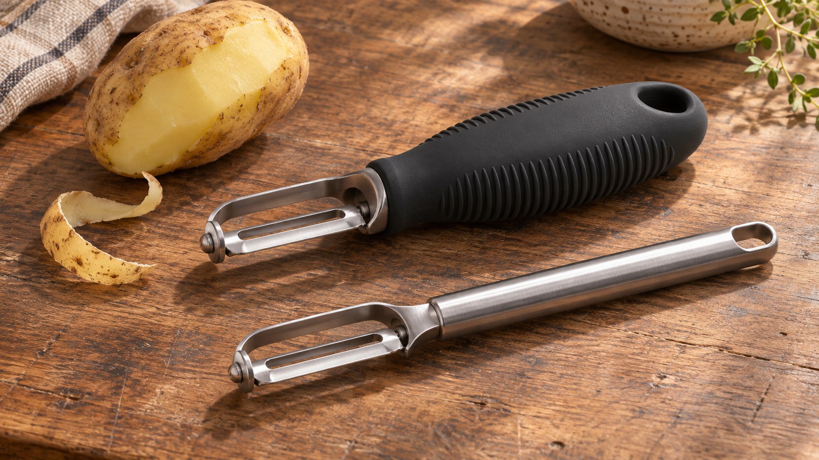
A vegetable peeler has a sharp end and a familiar job. OXO’s Good Grips story starts at the other end: the part that has to stay in someone’s hand while the blade works.
The broad black handle made that ordinary tool look different. Its more interesting achievement was to make a difficulty with grip the starting point for a product intended for a much wider audience.
There were two design questions inside it. Could the handle be more comfortable to use? And could a person looking at it understand that it might feel different?
The difficulty was in the hand
The Institute of Design’s account of Sam Farber describes the uncomfortable peeler he and his wife Betsey encountered while cooking. Betsey’s difficulty with the tool helped set the direction for Good Grips: a fuller, rubbery handle, with flexible fins influenced by bicycle grips.
The important shift was in who the resulting object was for. The account presents Farber’s intention as making a better ordinary tool, including for people with arthritis, rather than creating a separate product defined by a user’s condition.
That does not establish that one handle suits every hand or every need. It does change the question asked of the product. Instead of treating discomfort as something a particular user must work around, the handle becomes something the designer can reconsider.
A black handle that asked to be touched
In its history of the Good Grips handles, OXO describes the wide oval form and thermoplastic rubber used in the original line introduced in 1990. The company explains the material choice in terms of softness, grip and its suitability for joining with other kitchen-tool materials.
OXO also gives the fins a second job. They flexed under a finger and invited people to try the unfamiliar handle. The company recalls retailer demonstrations that placed a peeler beside carrots so shoppers could experience the difference.
Those are the manufacturer’s explanations of its design and retail approach, not independent measurements of customer response. They nevertheless reveal a useful distinction: making a surface yielding and making its yielding quality apparent are different tasks.
A smooth photograph cannot let a shopper squeeze rubber. A visibly flexible detail can at least suggest an action. The handle offered a small invitation to find out, with the tool itself supplying the demonstration.
The grip became a family resemblance
Smart Design’s account of its OXO partnership credits its work on both the tools and the brand identity. It describes a straightforward black-and-white packaging system alongside the products.
This puts the recognisable handle and the recognisable box in different roles. Packaging can identify a range before a purchase. The handle remains part of the object after the box is discarded, returning to someone’s attention whenever the tool is used.
The relationship is more substantial than repeating a colour. A large black grip identifies the place to hold, changes the object’s outline and provides a physical experience. Its appearance is tied to an action rather than sitting on top of the object as decoration.
There is a limit to what that observation proves. It does not show that the handle alone caused the brand’s growth. It explains why the working part of a product can also carry a consistent identity.
Keeping the idea did not require freezing the shape
The later Good Grips refresh described by Smart Design makes the history more interesting. Its account contrasts an original common handle used across tools with later designs developed around particular cooking tasks.
The designer describes prototyping each redesigned tool and considering the relationship between its working end, handle and use. Familiar fins could evolve with the object rather than being attached identically everywhere.
These are participant accounts of the development process. They should not be mistaken for an independent comparison proving that every later version outperforms every earlier one. What they document is an intention to preserve a design principle while changing its expression.
A peeler, a whisk and a can opener share a kitchen, but they do not ask a hand to perform the same movement. A family resemblance can help people recognise them without requiring one physical answer for every task.
Good Grips therefore offers a more satisfying history than the familiar moment of inspiration alone. A difficulty noticed in one person’s hand led to a product for ordinary use; a flexible detail helped make that idea visible; and a recognisable range still had room to change.
The blade explained what the tool did. The handle gave people another reason to pick it up.
Sources and perspective
The linked Institute of Design tribute supplies the inclusive-design context. OXO and Smart Design are participants describing their own work. Their retrospective accounts differ on some early chronology and launch-range counts; those details are not needed for the handle story and are not asserted here. The interpretation of recognition, touch and continued change is Time for Designs’ editorial analysis.