

A familiar software name can become so successful that it does two jobs. It identifies the application people use, and it stands in for the organisation behind it. The Document Foundation® has decided those jobs now need different signatures.
Its 9 October announcement introduces an identity created with Ura Design. The foundation says it previously represented itself with the LibreOffice® logo. It wants a separate identity for institutional work, including document standards and discussions about interoperability. LibreOffice’s own name, logo and identity remain unchanged.
That distinction makes this more interesting than a new icon for an application. The organisation is changing how it identifies itself while leaving the product’s familiar identity in place.
The page gives the organisation the space
The new mark keeps a clear connection with documents. A green page outline sits beside the words “The Document Foundation”, arranged over two lines. Diagonal white gaps cross its upper portion, giving the small symbol a rhythm that the long name does not need to carry.
Look at the foundation’s published identity board. The name remains prominent across light, dark and green backgrounds. Smaller square examples give the page symbol a surface of its own. The board shows a family of applications rather than one logo floating in isolation.
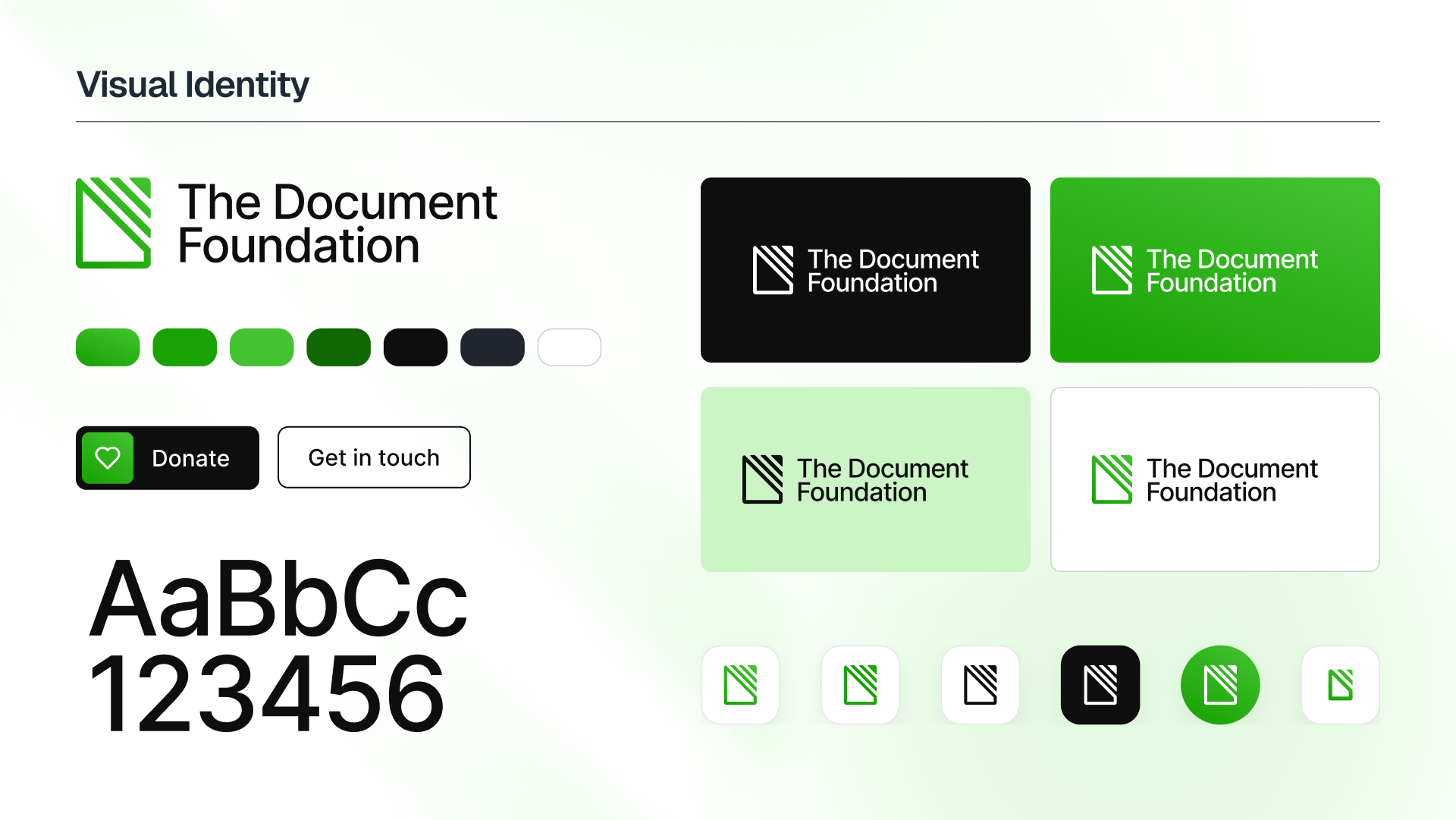
The important omission is the product name. Someone encountering this signature is being introduced to the foundation itself. That is our reading of the visible arrangement, rather than evidence that every reader will immediately understand the distinction.
A logo cannot explain the entire relationship between an organisation and its software. It can, however, stop requiring the product’s name to introduce the organisation every time.
A shared typeface is a different kind of openness
The identity uses Inter. Its creator’s official typeface site describes a family designed for uses ranging from interfaces to marketing and signage. It also links the SIL Open Font License that governs it.
That gives the choice a practical dimension. People preparing material can obtain the same typeface, rather than approximating a proprietary one they cannot access. A shared set of letters makes repeating a visual identity easier; it does not remove the need to choose suitable sizes, spacing and layouts.
Nor does an open font make every surrounding asset unrestricted. The foundation’s mark policy permits factual references while setting conditions intended to prevent confusion about affiliation. The freedom to use a typeface and permission to present something as an organisation’s own material are different questions.
The distinction fits this particular story. Clear identification is the purpose of the change. A signature becomes less useful if it leaves people unsure who produced the page on which it appears.
The rollout is part of the story
The announced rollout covers the foundation’s website, social accounts and institutional documents over the coming months, with Writer and Impress templates to follow. It asks people describing the organisation to use its new identity, while material about LibreOffice should retain the software’s logo.
That is a useful boundary to examine. A foundation report and a page introducing an office suite may concern related work, but they introduce different things. Giving each the appropriate name can make that relationship more explicit without demanding a replacement identity for the application.
It also means an announcement is only one stage. The published plan does not establish that every template and account has already changed, or that audiences have noticed the distinction. Those would need separate evidence.
A current identity story with a modest promise
Brand New listed the identity on 16 October, following the foundation’s announcement earlier in the month. That recent specialist attention makes it a current design story. It does not establish a surge in search interest or prove that the change has succeeded.
The interesting promise is smaller and more inspectable. The new signature gives an institution its own place on the page. The software keeps the identity its users know. The design’s job is to make room for both roles without making them look like one interchangeable thing.
Sources
The Document Foundation’s announcement and rollout; official identity board; Inter’s creator and licence information; TDF mark policy; Brand New’s dated listing.