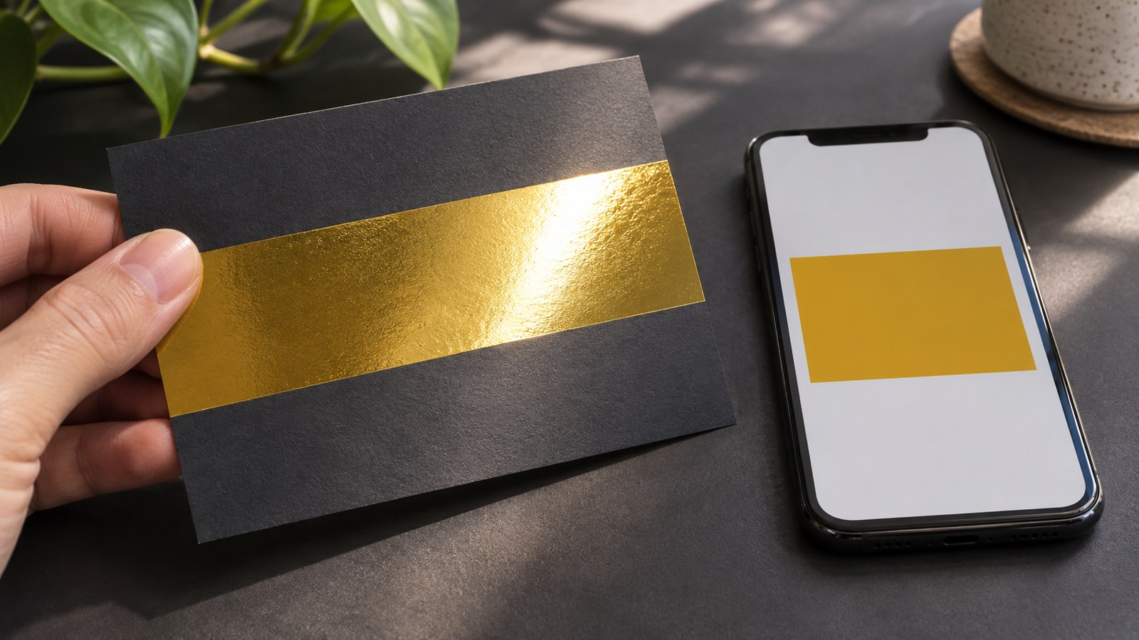
A gold rectangle on a screen can describe a colour. It cannot, on its own, promise a metallic printed surface.
The difference becomes obvious when a physical sample catches the light as it moves. A convincing colour preview and a convincing reflective finish answer different questions. Before approving the artwork, decide which one the job actually needs.
Gold can name an appearance or a production requirement
Imagine a fictional invitation with a gold-coloured band. One version calls for a warm printed colour that sits quietly within the design. Another calls for a band whose surface visibly responds to light. The drawings might look similar in a small emailed preview while describing different expectations.
Neither intention is inherently better. The problem begins when one person approves the colour and another believes the approval includes the physical effect.
Write down the intended result in plain language. “A gold-coloured printed band without a reflective finish” is a different request from “a reflective gold finish, with the production method to be confirmed”. The latter still needs a material and process decision; the word gold does not make it complete.
A metallic effect needs an actual production route
Roland DG’s metallic-printing overview describes metallic inks for selected printers and the use of metallic silver with other inks to create coloured metallic effects. Its examples concern a supported ink system, not ordinary colour values making any printer produce the same finish.
The manufacturer’s VersaWorks special-ink documentation also requires supported special inks to be identified in the print data using the corresponding spot colours. This is a specific workflow, not a universal instruction for every metallic job.
These sources establish why the method matters. They do not establish which inks are installed in a particular machine or whether a particular business can supply the effect. A brand of printer, a software swatch or an image of a shiny sample is not enough evidence.
Nor should metallic ink, foil and a metallic material be treated as interchangeable names in a brief. Ask which route is proposed and what sample represents it. Without that answer, two suppliers might be discussing visibly different results under the same loose description.
The sheet is part of the result
Pantone’s explanation of coated and uncoated references describes how paper affects the appearance of printed colour. It distinguishes ink behaviour on coated and uncoated papers. The general lesson for approval is to identify the surface, not just the colour name.
That source is about colour references on paper; it does not predict the shine of every metallic process. For the fictional invitation, it nevertheless exposes a missing part of a brief that specifies gold while leaving the stock undecided.
A physical reference on a different paper can be useful for conversation. It should not silently become a promise that the final combination will behave identically.
Give the preview a defined job
A screen preview remains useful. It can show where the band goes, how much space it occupies and how it relates to the wording. Those are meaningful approval decisions.
It may also use a drawn highlight to suggest the intended effect. Treat that as an illustration, not as a measurement of the future printed finish. A highlight baked into an image stays in the same place when the page is moved; it does not establish how a physical surface will respond.
Separate the approvals. The layout preview can establish placement and content. A relevant physical sample can support discussion of material appearance. The confirmed job specification connects those decisions to the actual process.
This avoids an unhelpful argument about whether a phone’s gold looks correct. The more useful question is whether everyone is approving the same kind of thing.
Ask what the sample proves
When discussing printed artwork and finishing requirements, explain whether a metallic effect is essential and ask what production route and sample can be confirmed for the job. Do not assume availability from a general printing service description.
Identify the intended stock, the area receiving the effect and the proposed method. If a supplied reference uses another material, record that difference. If the sample is illustrative rather than representative of the job, say so before approval.
View the physical reference from more than one angle in the conditions relevant to its use. This is a practical comparison to agree, not a claim that one lighting setup provides a complete technical certification.
The aim is not to make a screen imitate every property of metal. It is to let the screen preview, physical reference and production specification each answer the question it can actually answer.
Sources: Roland DG’s application overview and specific VersaWorks instructions, plus Pantone’s paper-reference explanation, linked above. The pictured card is an editorial illustration, not actual Time for Designs work or a material test.