A boarding pass has an unusual design problem: the person holding it and the machine checking it do not read the same way.
The traveller looks for a destination, a gate or a seat. A scanner looks for an encoded pattern. A document can make one of those jobs straightforward while leaving the other awkward. Its success depends on the relationship between the two.
The code allowed the document to change
IATA’s explanation of Resolution 792 describes a two-dimensional barcode format for boarding-pass data that can be presented on paper or mobile devices. The standard concerns encoded information, rather than one compulsory visual layout for every airline.
That distinction is the important design development. The information a system needs can have a defined structure without requiring every passenger to carry the same kind of physical object. A piece of paper and a phone can become different presentations of a machine-readable message.
The human-facing design still has work to do. A scanner accepting a code does not tell us that a passenger can readily find the gate. Conversely, a beautifully organised printed pass does not prove that its machine-readable area will work in the intended system.
Paper was not simply replaced overnight
An IATA announcement reproduced by Breaking Travel News on 11 October 2007 described a mobile barcode standard, following a paper two-dimensional standard established in 2005. It presented an end-of-2010 industry implementation target. A target in an announcement is not evidence that every airport completed a change on that date.
The announcement also distinguished agreeing a code standard from developing the processes needed to use it. This is a useful corrective to the idea that inventing a printable pattern automatically changes an entire journey. Issuing, displaying and accepting the message have to connect.
From a design perspective, this means the boarding pass belongs to a sequence. Someone obtains it, finds the relevant information, presents it and responds to what happens next. The visible rectangle is one part of that sequence, even when it looks like a self-contained document.
The question changes as the journey continues
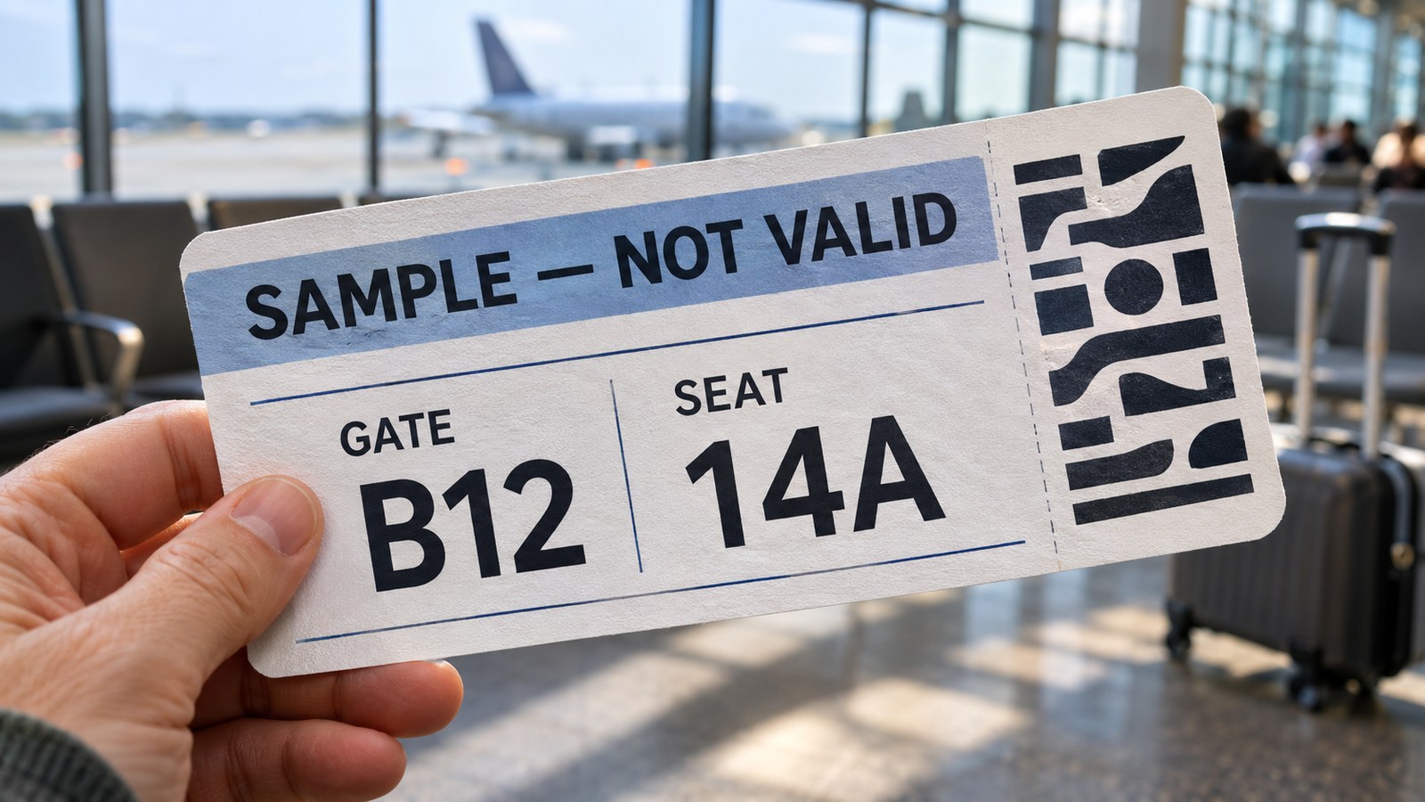
Consider a fictional passenger looking at a sample pass before reaching the gate. “Where do I go?” is different from “Which seat is mine?” Those details can both be correct while competing for attention.
A useful way to examine the layout is to name the question each prominent item answers. A gate label should identify the meaning of its value. A seat label should do the same. A large unexplained code may be visually striking while requiring the reader to work out what kind of answer it represents.
This is not a proposal to impose one layout on all airlines. It is an editorial reading exercise: cover the surrounding decoration and ask whether the remaining labels make the values understandable. Then look at the complete pass and ask whether the information needed at that moment is easy to locate.
The exercise also separates two kinds of familiarity. Frequent travellers may recognise an abbreviation immediately. A first-time traveller may need its label. A layout that feels sparse to an experienced user can feel cryptic to someone still learning the system.
A scan is one interaction, not the whole experience
A barcode can carry structured information efficiently. It does not remove the need for plain instructions around it. The passenger still needs to know what to present and where to look next.
The paper object may also be held, folded or partly covered by a hand. A screen has its own presentation constraints. These are reasons to examine a design in its intended use, rather than treating a flat artwork preview as the complete experience. They are not a claim that a particular fold, screen setting or print specification will be accepted by an airline.
There is a broader distinction here between information being present and information being usable. A gate printed somewhere on a page is present. A gate clearly labelled and easy to find answers a question. An encoded message adds another layer whose usefulness depends on the system reading it.
For comparison, a ticket that separates into two pieces has to preserve meaning after a physical change. A boarding pass has to preserve meaning across different readers. Both reveal why a complete-looking piece of print deserves more than a spelling check.
Two readings of one object
The boarding pass is interesting because neither reading makes the other redundant. The traveller needs comprehensible information. The system needs an intelligible message. The strongest design connects those needs without asking the passenger to understand the encoding.
That is why the barcode alone is not the whole design story. The small labels around it are doing a different job: turning a technical transaction into something a person can follow.
Sources and scope
IATA’s current Common Use explanation supplies the purpose of Resolution 792. The linked 2007 announcement provides the historical milestone and its stated target, not proof of universal adoption. The sample document and passenger scenario are fictional design illustrations. This article is not an airline check-in instruction or a boarding-pass production specification.