
A website photograph fits neatly into a phone screen. That tells you how much space it occupies on the page. It does not, by itself, tell you which image file the browser loaded or how many bytes were transferred.
When discussing website imagery, keep the displayed space, available source files and actual loading evidence separate.
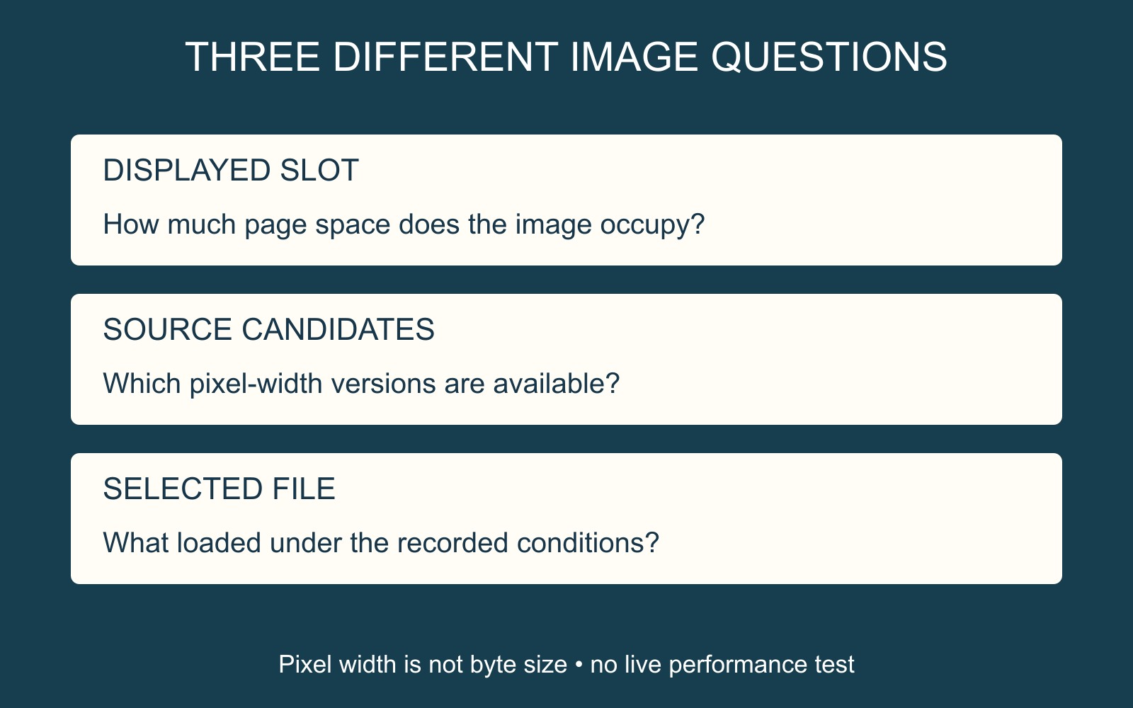
Display size and source choice are different
MDN's responsive images guide explains how an HTML image can offer several source candidates. With width descriptors, srcset identifies their intrinsic pixel widths and sizes describes the expected display slot.
The browser can use that information alongside conditions such as pixel density when selecting a source. A phone does not necessarily receive the smallest candidate: a dense screen can need more image pixels than its layout width might suggest.
Making one large source fit a smaller space with CSS does not establish that a lighter source was downloaded. Equally, candidate pixel width alone does not tell you the file's byte size.
Supply useful versions of the same composition
The diagram shows one original geometric composition available at different pixel widths. It is a source-selection explanation, not a measured website result or a recommended universal export size.
For an actual photograph, discuss which versions suit the places where it appears. A full-width banner and a small content card have different display roles. Give the provider the original image and explain the important subject area before versions are prepared.
Choosing another crop is a separate creative decision. More candidate widths of the same composition do not automatically preserve a face or sign that the layout crops out.
Ask for the selected-file evidence
A useful website design brief can ask the provider to identify the rendered image space, selected source and loading evidence at agreed screen conditions. Include the page and image role so the discussion concerns a specific asset.
Use existing evidence or the agreed review route; repeatedly reloading a live page is not a substitute for a clear comparison. Record the conditions behind any reported result. Responsive candidates are one part of image delivery, so avoid treating their presence as proof of a faster page or a search-ranking improvement.
Source: MDN linked above. All diagrams use original geometry; no customer image, download saving or live performance result is represented.