
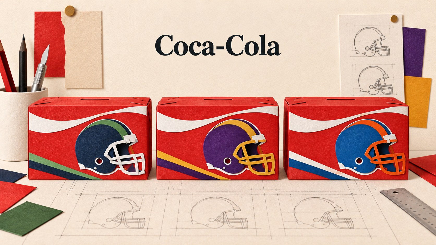
A football pack has two identities to carry: the drink you recognise and the team you care about. Coca-Cola’s current US campaign makes that tension unusually visible. The useful detail is how the balance changes from a bottle to a carton.
A familiar drink, a more particular invitation
A team-themed Coca-Cola pack might catch your eye when choosing drinks for an American football gathering. You know the drink already; the team identity gives the familiar product a more particular setting. The design problem is to keep the product easy to identify while giving the other identity meaningful space.
Coca-Cola announced the return of its “Fan Work Is Thirsty Work” campaign on 25 August 2026. Its company announcement describes limited-time packaging for 13 college and 12 professional football teams in selected markets. It places the packs within a wider programme of advertising, events and fan activity.
On 6 October, Packaging World reported on the design and production. Coca-Cola’s spokesperson said the retail packs were available and expected to remain through football season. That places this discussion inside an ongoing campaign.
The question is simple to state and harder to draw: how much can a pack change for a particular audience while still being recognisably the same brand?
The team gets more than an empty logo box
The spokesperson describes moving from a small approved team-logo space towards larger team identities within a template.
That distinction matters. A small logo box treats the partner as an attachment. A larger team identity can change how the whole surface feels.
For a fan, the difference might be between spotting an official association and seeing a pack that feels suited to their gathering. That is our interpretation of the design opportunity. It is not evidence that customers preferred these packs or bought more of them.
The system has to accommodate a difficult relationship. Team identities are often strongest because they distinguish one group from another. Coca-Cola wants to remain identifiable across those differences. Giving every team complete freedom would risk losing the connecting identity; giving every team too little room would weaken the reason for making variants.
The interesting decision is therefore where to place the boundary. The brand can hold some elements steady while allowing others to respond to the audience. Consistency then becomes a set of deliberate decisions rather than a rule that every version must look identical.
A bottle and a carton do different jobs
Packaging World reports that Coca-Cola leads on the 20-ounce bottle label, with team identity underneath. On the 12-pack carton, team graphics have a larger role. The company describes red as a connecting foundation across the designs.
A bottle and a carton offer different amounts of space. They also present different faces when held, stacked or set down. A single layout enlarged or reduced to fit both would leave useful opportunities unexplored.
That is a useful way to think about branded print. A small sticker, an event poster and a sponsor board do not need equal proportions of every element. They need a clear order suited to what someone must recognise in each setting.
For example, a club poster may lead with the fixture and team, while a sponsor board gives the supporting businesses more room. The same club identity can connect both. These are illustrative comparisons, not claims about Coca-Cola’s approval process.
The mistake would be to judge every format from one attractive flat mock-up. The relevant test is whether each real surface gives the necessary information enough room.
The team count is not the layout count
The production detail is especially useful. The spokesperson reports 44 carton layouts and 30 bottle layouts across Original Taste and Zero Sugar, printed flexographically with six colours per format.
Those counts describe different things from the 25 participating teams. One counts identities represented; the other counts layouts. Neither tells us the exact number of production files. A customer-facing campaign can sound simple while the artwork behind it becomes more complicated.
We should not invent the reason for each individual file or try to assign every layout to a team. The report does not provide that complete breakdown. It does show why an audience list alone is not an adequate production checklist.
A smaller project can encounter the same kind of expansion. A club may need a member version and a sponsor version. An event may require two dates in three sizes. A branch may need its own address on an otherwise shared leaflet.
Before printing, those choices need to become an explicit list of outputs. Otherwise, the team can approve a design concept while overlooking a wrong date, missing variant or outdated detail in a later file.
The practical question is not simply how many designs have been shown. It is how many distinct pieces of approved artwork must reach production, and how someone can identify the correct one.
Local relevance also creates a distribution question
The campaign is described as available in selected markets. That qualification belongs in the story. It should not become a claim that every US shop carries every team, or that Irish customers can buy the same range locally.
A geographically relevant design only works as intended if it reaches an appropriate setting. A version made for one audience may be less useful somewhere else. This creates a connection between the design decision and the plan for where the finished items go.
For a business with several locations, the comparable issue could be keeping the correct branch address on the correct stock.
Design cannot resolve that problem alone. Clear file names, an output list and a distribution check give the visual system practical support. None of those measures is glamorous, but each can help preserve the meaning of the variation.
That is also why more versions should have a reason. Variation adds approval and handling work. A version that makes no useful difference to the reader can create effort without improving the communication.
A recognisable pack is not a measured result
The company presents the campaign as a way to participate in fans’ rituals. The sources reviewed here document the announced programme and explain aspects of its packaging. They do not establish an isolated sales effect from the new artwork.
The promotion also includes scannable experiences and opportunities to win prizes. Those are parts of the wider offer. Scans and entries do not isolate the artwork’s effect on purchases.
There are competing readings of the pack itself. Greater team presence may help it feel more relevant to a fan. It may also make the drink’s identity less immediate in some views, or make the wrong team more noticeable to someone who supports a rival.
The available evidence does not tell us which effect wins. That uncertainty makes the design choices worth examining rather than declaring the campaign a success in advance.
For a business considering its own variants, the appropriate test should match the purpose. Can someone find the correct location? Can they distinguish the right event? Can they still identify the organiser? Those questions are more useful than collecting general compliments about the artwork.
Three decisions to make before creating variants
The following is Time for Designs’ practical interpretation, not Coca-Cola’s internal checklist.
Choose what must stay recognisable. Identify the information or visual feature that connects every version. Check that it survives the smallest format and the busiest variation. Do not assume that placing a logo somewhere guarantees clear identification.
Choose what deserves to change. A team, branch, date or audience may need different prominence. Give the variation a specific job. If the only explanation is that another version would look interesting, reconsider whether it is necessary.
Approve the complete set of outputs. Review the actual sizes and variable details, not only the master design. Confirm which version goes where. Keep a record that a person outside the original design conversation can follow.
For projects involving business printing, that discussion can begin before artwork is final. The useful question is which details need to vary, in which formats, for which readers. Quantities and production suitability still need to be assessed for the actual job.
The brand needs a system with room to move
Our earlier story about Coca-Cola’s contour-bottle brief examines a physical shape intended to carry recognition. This campaign asks a different question: how can a familiar identity share its surface with other identities?
There is a related tension in Jif’s packaging refresh, where familiar branding meets a new invitation to use the product. In each case, the design has to decide which part of familiarity helps and which part needs room to change.
The transferable idea is a controlled relationship between what stays fixed and what varies. Make that relationship explicit, and several versions can belong together while still giving each audience something particular to recognise.
Sources and scope
The linked announcement records Coca-Cola’s campaign plans. Packaging World supplies original spokesperson reporting; the design and production explanations remain company-attributed. Format comparisons and the checklist are Time for Designs’ editorial analysis. No sales uplift or first-hand project outcome is claimed. Information checked on 12 October 2026.