
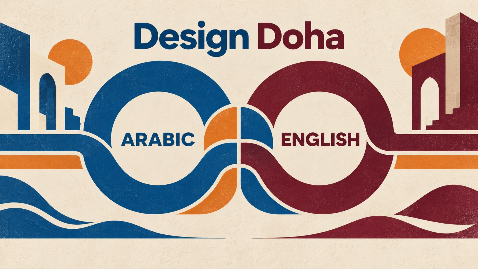
Two languages can appear in a design while still having very different status. Design Doha’s new identity raises a more interesting question: what changes when both help shape a shared composition?
Both languages share the composition
An event identity has to introduce an occasion before the visitor reads a programme. Its lettering, colours and repeated shapes suggest what kind of place the event will be. In a bilingual identity, they can also suggest who is expected to feel at home.
Consider a hypothetical poster. One language gets the distinctive heading, generous space and strongest contrast. The other appears in small type underneath. Both are technically present. They do not contribute equally to the first impression.
That arrangement may suit a particular brief. But if the aim is equal presence, adding the second language after the main design is finished leaves a problem that translation alone cannot solve.
Pentagram’s project account for Design Doha Biennial 2026 describes a different relationship. Samar Maakaroun and her team put Arabic and English together in a shared typographic composition, with equal presence as a stated aim.
This is the agency’s explanation of its work, not evidence that every visitor will experience the result in the same way. It nevertheless gives us a specific design decision to examine. The languages are not simply two pieces of copy waiting to be placed. Their relationship is part of the identity.
Why this is a current design story
Design Week covered the identity on 13 October 2026. The organiser’s current event page gives 5 November as the opening date for the 2026 biennial in Doha, Qatar.
The timing matters because the discussion concerns a system being presented ahead of an event, rather than a completed event’s measured reception. The opening is still ahead at the time of writing.
The identity has attracted recent specialist coverage. That is enough to make its design question timely; it is not proof of widespread search interest, ticket demand or a successful campaign.
A cultural event is also a useful setting for this decision. Its public presentation must connect a common occasion with the different work inside it. The identity needs to belong to the whole programme without making every exhibition feel interchangeable.
The design has two jobs here. It expresses a relationship between languages. It also gives the wider event a shared structure.
The connecting line does more than decorate
Pentagram describes extended strokes from the letterforms linking elements across the identity, like points in a network. The agency also says the earlier Design Doha blue remains in the new system.
Those connecting lines give a broad idea something visible. That is our reading of the design. The identity can show a relationship repeatedly, rather than leaving “connection” as a word in a strategy document.
There is a difference between a line placed behind the typography and a line that grows from the typography. The first can become an extra decorative layer. The second can make the lettering itself carry the idea.
That does not automatically make the second approach better. It gives the designer more responsibility. A distinctive stroke can earn attention, but it must also coexist with the word people are trying to recognise.
For another organisation, the corresponding question is whether a recurring graphic feature has a clear job. Does it explain a relationship, separate two choices or help a family of materials belong together? Or is it simply added because the page otherwise feels empty?
Design Doha’s documented approach gives that question a concrete starting point. The connection comes from the central material of a bilingual identity: its letterforms.
Equal presence does not mean identical treatment
Does “equal presence” mean the same point size and an identical rectangle for each language? Treating it that way would turn a visual aim into a rigid rule.
Different scripts do not offer the same shapes to a designer. A shared composition needs to accommodate those differences rather than pretending they do not exist. The relevant judgement is how the two treatments work together at the size and in the setting where people encounter them.
Nor does equal prominence mean every piece of information must become equally loud. A heading, a venue name and a practical instruction have different jobs. Within each job, the designer can consider what a reader using either language needs to find.
This creates two levels of review. One concerns the identity: does the overall presentation give the languages the intended standing? The other concerns the information: can someone find the relevant answer without already knowing where to look?
A design can satisfy one level and still need work at the other. A balanced title does not establish that a visitor can find an exhibition’s opening time. A very clear timetable does not, by itself, create a distinctive event identity.
Keeping those judgements separate helps the brief remain specific. It avoids asking one attractive composition to prove every part of an experience.
A shared composition still needs a usable reading route
The distinction becomes clearer when a design moves between print and a phone screen. A wide arrangement has space for relationships that a narrow display may need to reorganise.
The W3C’s guidance on writing direction explains that scripts have direction and that this affects web layout. Arabic uses a right-to-left script; the Latin script used for English runs left to right. This is a practical consideration, not a reason to make one version secondary.
For a hypothetical bilingual event page, each language should have a coherent route from heading to essential details to the next action. That is a task to check in the actual page, not something a brand image can establish.
For a printed programme, the comparable task is to find a particular exhibition and its location. For a compact invitation, it might be to find the date. Those materials can share an identity while arranging their information differently.
The point is not to infer a defect in Design Doha’s website or print. We have not conducted a visitor test or an audit of its complete materials. It is to identify the additional questions a bilingual system creates when it becomes something people use.
The expressive composition and the practical reading route need to support each other. Neither replaces the other.
An exhibition can speak more strongly within the family
Pentagram describes a heavier typographic treatment for the headline exhibition, Arab Design Now, while retaining the bilingual structure and connective logic of the wider identity.
This introduces another useful distinction. A common identity does not require every part of an event to have the same visual strength. A prominent exhibition may need its own emphasis while keeping enough shared structure to belong to the programme.
The difficult question is what can change without breaking that relationship. A name, weight or scale may vary. The organising idea may remain visible through how those elements behave together.
For a reader, that can provide two pieces of information at once: this is a particular exhibition, and it is part of the larger event. The design can make both relationships available without adding a long explanation to every surface.
That is an opportunity rather than a documented audience outcome. The sources explain the intended system. They do not supply research showing how reliably visitors recognise its different levels.
The strongest objection is a practical one
A shared composition might be admired as a design object while proving difficult to adapt. Integrating two scripts closely could make later changes more demanding than updating two separate text blocks.
That possibility should be part of a fair review. A programme can change. Names can be long. A small format may offer less room. A language reviewer may need to correct wording after the first layout has been prepared.
None of those possibilities is a reported problem in this project. They are conditions that a useful system should be prepared to face.
The sensible response is not to reject expressive bilingual design. It is to ask how the system behaves when real content changes. Can it retain its idea with a longer heading? Can the two languages remain complete when the available space narrows? Who reviews the corrected version before it is used?
Those questions can reveal whether a design idea has become an adaptable system. A perfect sample with short, carefully chosen words cannot answer them all.
A better brief asks for both language versions early
For an organisation preparing bilingual materials, our practical interpretation begins before choosing a typeface. Establish the intended relationship between the languages and the reader tasks the material must support.
Then provide the actual approved wording in both languages while the layout is still being developed. A placeholder of convenient length can hide a problem that appears as soon as the real text arrives.
Review language quality and visual arrangement as connected stages. The wording reviewer should see it in the layout. That is how a reader will find the heading, date or instruction. A designer’s approval of appearance is not a substitute for a language check.
Finally, review the actual outputs. A programme spread, a narrow web page and an invitation may require different arrangements. Check that the relationship remains clear and the necessary information stays complete in each one.
For projects involving business printing, this means discussing language versions, finished sizes and approval responsibilities before treating one attractive mock-up as the final answer. The appropriate production route still depends on the actual job.
The useful lesson is who helps shape the idea
Our story about Coca-Cola’s football packaging examines how different team identities share a familiar brand surface. Penguin’s changing cover system offers another view of a family that can accommodate variation. Neither is a substitute for understanding the particular needs of a bilingual composition.
Design Doha’s decision is worth considering because the languages are related elements of one identity. It makes their relationship part of the composition, not just a question of whether both sets of words are present.
Our broader briefing advice is useful for communication aimed at more than one audience. Decide what each audience should be able to recognise and do. Then let those needs help shape the idea before the layout becomes difficult to change. This is our recommendation, not a reconstruction of Pentagram’s workflow.
Sources and scope
Pentagram’s project account documents its design approach; Design Week establishes recent specialist coverage. Design Doha’s organiser page supports the stated future opening, and W3C provides the limited writing-direction reference. Comparisons, possible constraints and briefing advice are Time for Designs’ editorial interpretation. No visitor research, firsthand project experience, measured cultural inclusion or commercial result is claimed. Checked on 14 October 2026.