A signwriter can paint a shadow that never moves. Sunlight does not offer the same arrangement.
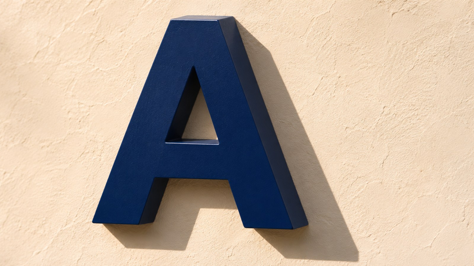
That difference sits behind an old lettering problem. A painted letter can appear to have a thick side and a cast shadow, even when the board is flat. A solid letter has actual sides. Its relationship to the surrounding light is part of the object, rather than a permanent mark in the artwork.
The signwriter had to choose a light that would not stay still
The historical manual How to Write Signs, Tickets and Posters, edited by Paul N. Hasluck, discusses this in its section on shaded and fancy lettering. On printed pages 98–99, it explains how painted thickness and shadow can suggest solidity that is not really there.
Then it identifies the outdoor difficulty: a painted shadow cannot keep agreeing with the direction of daylight throughout the day. A treatment that appears consistent with morning light may not do so in the afternoon. The manual advises considering the sign’s position and the dominant light rather than pretending the problem disappears.
This is not a reason to dismiss shaded lettering as a mistake. The same passage recognises conventional effects, including a shadow painted beside a letter that appears flat. The illusion can be deliberate. What matters is understanding whether the shadow belongs to the drawing or to the physical object.
Three different things can look dark in a photograph
Look closely at a dimensional letter and separate its face, its side and the surface behind it. A dark side is still part of the letter. A cast shadow lies on another surface. A painted dark area might imitate either one.
The International Sign Association’s glossary defines a dimensional letter as a letter, logo or symbol made by cutting, casting, fabrication or moulding. Its definition concerns an object with physical form, not a flat graphic that merely looks three-dimensional.
A front-on drawing can conceal that distinction. It may show the same outline and face colour for two very different proposals: a flat image with a shadow effect, or a raised form whose sides project from the background.
From another angle, the physical sides become visible. Under different light, the cast shadow can change. These are observations about geometry and light, not a claim that one construction will always be easier to read or more attractive.
Depth does not automatically provide illumination
Another distinction is easy to blur in a digital mock-up. A raised letter is not necessarily an illuminated letter. A bright edge in a rendered picture might represent a material highlight, an external lamp or a lighting system behind the letter. Those are different specifications.
The British Sign and Graphics Association’s design guidance treats visibility and legibility, internal illumination and individual-letter illumination as separate subjects. Its overview also distinguishes being able to see a sign from being able to read it.
That is a useful restraint on a persuasive picture. A dramatic shadow demonstrates neither a reading distance nor night-time performance. An attractive front view does not establish the material, fixing arrangement or lighting method.
The background is part of the effect
A cast shadow needs somewhere to fall. A smooth, pale wall and a textured, dark background do not present it in the same way. The viewing angle also changes how much of the letter’s side is visible.
For that reason, a design shown on a neutral rectangle is only part of a sign brief. The actual background, position and expected light belong in the discussion. A close photograph of a small sample cannot stand in for a measured assessment of the proposed location.
If you are discussing signage for a particular wall or shopfront, supply a photograph of the location and explain when people need to use the sign. Keep the proposed face colour, physical depth and lighting questions identifiable as separate choices. The achievable specification still needs to be agreed for the actual job.
A flat illusion and a solid form can both be intentional
The historical signwriter’s difficulty survives the move from paintbrush to screen: the artwork can freeze one relationship between light and shade, while a real place continues to change around it.
A painted effect gives the designer control over a permanent image. A raised form adds physical surfaces that respond to the setting. Neither decision is explained by the word “premium”, and neither can be judged fully from a front-facing outline alone.
The useful question is simpler: which parts are marks, which parts are objects, and which parts will be made by the light on the day?
Sources: the historical manual’s shaded-lettering discussion, the ISA glossary and BSGA design overview are linked beside the relevant claims. The illustration is generic; no sign, material, fixing, reading distance or lighting performance was tested by Time for Designs.